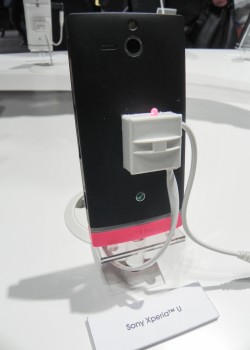
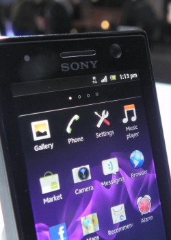
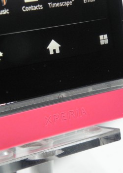
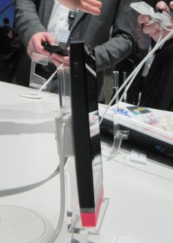
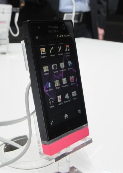
CES 2012 was the debut time for Xperia S and the Xperia Ion from Sony and now MWC 2012 brought us two news phones: the Xperia U and Xperia P. The first is shown in the following pictures and video, courtesy of a hands on experience in Barcelona. We’re dealing with a midrange unit here, with a design similar to the Xperia S, but in a smaller shell. There’s also a concept of changing the lower plasticky side for different styles and different colours.
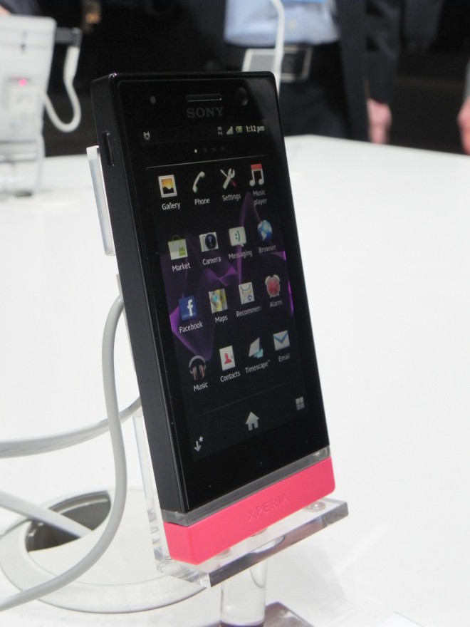
Known for a while under the codename Kumquat, this handset uses a compact design and provides the classic Sony (Ericsson) software experience, including TimeScape. The device relies on a Reality Display screen and brings forth evolved transitions and effects in comparison to the Xperia Ray and Play for example. The transparent bar on the handset is a fashionable feature, since it’s able to change color depending on the colour of theme applied to the screen. And now here’s a list of specs:
- Dimensions: 12mm thickness, 110 grams weight
- Display: 3.5 inch, 480 x 854 pixels, Sony Mobile BRAVIA Engine
- Memory: 4GB internal, 512MB RAM, no microSD slot
- Connectivity: HSDPA 14.4 Mbps, WiFi, DLNA, Bluetooth 2.1, microUSB 2.0
- Camera: 5MP, autofocus, LED flash, 3D panorama, 720p 30 fps video capture, front VGA cam
- CPU: STE U8500, dual core, 1GHz
- Battery: Li-Ion 1320 mAh
- Other features: accelerometer, proximity sensor, compass, AGPS, FM stereo radio
At the time of writing this article, the Xperia U runs Android 2.3.7 with TimeScape and there’s an ICS update in the works. The hardware buttons on this device can be found on its right side, including the power button, volume buttons and the camera one. On the opposite side we find the SIM slot, the HDMI port and the USB port. The plasticky replaceable part below the transparent bar can be switched with pink, black or yellow versions of the same lid. Now it’s preview time:


