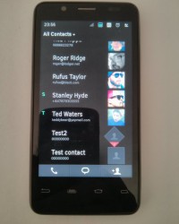
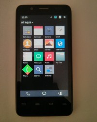
Among the companies that are working on the Tizen OS project we find Samsung and Intel, with the latter now working on its very own UI for the OS. The user interface is codenamed Obsidian and it may come to Android at some point.
Tizen is backed by the Linux Foundation and Samsung is the main supporter of the initiative, but they may not be able to come up with a decent proprietary UI for the platform, since Bada OS and TouchWiz didn’t get as much love as other UIs. That’s why Intel may have taken the helm of the project and came up with a Symbian-looking UI, if you allow me to be harsh.
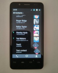
Of course, this may not be a final design, but it’s still underwhelming. It reminds me of the “flat” UI that Apple has adopted for iOS 7. By the way, notifications are implemented in an interesting way: icons are normally squares, but when something happens they will turn to 45 degrees and appear as diamonds and not squares.
When you select an app you’ll see a preview pane and you’ll get to handle some tasks without opening the full app. The omnipresent dock buttons once again remind me of Symbian, sadly. What do you make of this interface?


