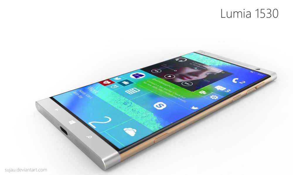
Yesterday we saw quite a bunch of new handsets getting announced, but there was also a pretty neat software launch: the debut of Windows Mobile 6.5, courtesy of Steve Ballmer and co. Engadget did a walkthough of the new OS, covering all of its weaknesses and strong points, so feel free to read on and discover what’s in stall for you on the future WM smartphones.
First, Engadget mentions the new locking screen, with its cool feature of allowing users to go straight to certain menus right from standby mode. The Home screen is also decent, but the gesture control is a tad difficult to get the hang of. WM 6.5 uses a focused bar for on-screen info and you’ll need to drag it from item to item, making you waste a bit of time.
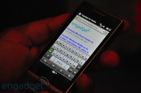
Windows Media Player is the same as it was on WM 6.1, a big disappointment for those who hoped to feel the Zune influence kicking in and we must also mention that 6.5 only works on resistive touchscreen devices, so it doesn’t support capacitive screens. The virtual keyboard is quite cool, not as easy to get used to as the one on the iPhone, but time will tell.
Honeycomb menus are not all “honey”, mostly because scrolling can be a pain, but at least IE Mobile performs well, although it has its flaw: the difficulty of using the zoom slider with a finger. Last, we must mention that the OS lacks swipe based scrolling, so you’ll have to tap arrows at the top and bottom of menus to navigate, keeping it old school and not cool.
This is however just an alpha version of the OS, so things are bound to change, for the better, we hope.
[via Engadget]

