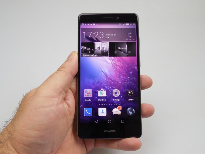
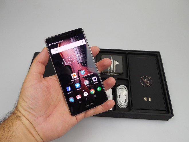
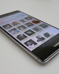
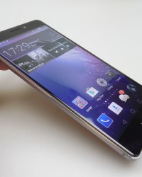
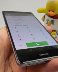
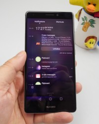
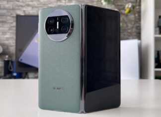
Huawei Mate S has got to be the best looking phones unveiled at IFA 2015 and right after the event we got it for testing purposes. This is a metal phablet, that has slightly curved screen edges and it’s priced at 649 euros in the 32 GB version or 699 euros ($780) in the 64 GB one. There’s also a 128 GB model with Force Touch, but that will be launched later on.
The device is some sort of follow-up to the Huawei Mate 7, or better said a relative of that model. It’s been a good year for Huawei, scoring a Nexus phone production and having at least two solid phones we tested, the P8 and P8 Lite. Back to the Huawei Mate S, it comes with a design that feels like it’s everything the HTC One M9’s design was not.
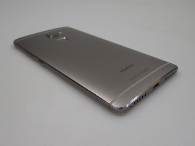
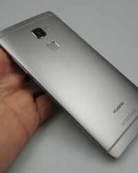
There’s no denying it resembles the HTC One M9 from the back, that’s slightly curved too, by the way. This phone measures 7.2 mm in thickness, which is great, compared to the 9.6 mm of the HTC One M9, or the 7.1 mm of the iPhone 6s. It’s still a bit thicker than the Galaxy S6’s 6.8 mm. The weight is 156 grams, which is 1 gram lighter than the HTC One M9.
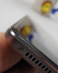
Still, the product feels well balanced in the user’s hand and much lighter than on paper. There’s a 2.5D screen panel upfront, more for beauty purposes, rather than actually extending the imaging part all the way to the edge. We’ve got a diamond cut aluminum unibody design here and the Huawei Mate S comes in gold, grey, champagne and rose gold. It has Gorilla Glass 4 protection and sits nicely in the user’s palm.
One hand usage is comfortable and the grip is quite good, plus I have to mention that the smartphone has a 2.65 mm thickness at the very edge. Upfront we find the selfie camera, discrete earpiece, notification LED and sensors, while at the back there’s the main camera, that slightly protrudes. Also at the back there’s dual LED flash, the fingerprint scanner and plastic cutouts for antennae.
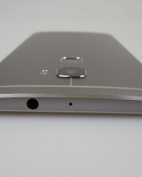
At the top there’s the audio jack and microphone, while at the bottom rests the microUSB port, speakers (or better said speaker, since only the right one is a speaker and the left one is only a grille). On the left side of the smartphone there’s the SIM card slot, that can be pulled out with a key and the dual SIM version of the phone also lets you use the second SIM card slot as the microSD one.
On the right there are very slim volume buttons and the Power button, all of them with good feedback. Overall, the Huawei Mate S is an elegant and sexy smartphone, better than the HTC One M9 and OnePlus Two for example, design-wise at least. It’s a comfy and premium device and now it’s time to move on to the hardware. The phablet provides an AMOLED Full HD screen with a 5.5 inch diagonal and On Cell technology.
It also has a HiSilicon Kirin 935 processor, an octa core 64 bit unit, with 4 cores clocked at 2.2 GHz and 4 clocked at 1.5 GHz, as well as a Mali T628MP4 GPU. We’ve got 3 GB of RAM on board, 32 or 64 GB of storage, or 128 GB in that special version. The back camera is a 13 megapixel unit, while the front shooter is an 8 MP one. On the connectivity side, there’s LTE, GPS, Glonass, Bluetooth 4.0, WiFi 802.11 b/g/n, microUSB 2.0 and sensors include: Force Touch, accelerometer, compass, gyroscope, proximity, hall and ambient light.
The battery of the Mate S is a 2700 mAh unit (non removable), that offered us a HD video playback time of 8 hours and 8 minutes, with WiFi on and brightness at 50%. That’s good, but not a record breaking value. Still, we beat the HTC Desire 816 for example and its 7 hours and 44 minutes, or the ASUS ZenFone 2 and its 7 hours and 30 minutes. We also beat the HTC Desire 820 and its 7 hours and 13 minutes, but scored lower than the Galaxy Note 4 (8 hours and a half), or the OnePlus One (8 hours and 53 minutes). Galaxy A5 was also superior in the playback area, with 9 hours.
The PCMark continuous usage test gave us a time of 6 hours and 26 minutes, which is once again good, but not ground breaking. It’s above the Huawei P8’s 5 hours and 31 minutes, or the LG AKA’s 6 hours and 22 minutes, plus the ZenFone 2’s 5 hours and 45 minutes. Still, there are other devices like the Galaxy A5 and its 6 hours and 51 minutes or the Galaxy S6 Edge and its 6 hours and 41 minutes of PCMark usage.
Allview E3 Sign also scores 7 hours and 15 minutes in the same test. Charging is reasonable on the Mate S, at 1 hour and 59 minutes. This is better than the LG AKA’s 2 hours and 8 minutes, or the Xiaomi Mi 4i’s 2 hours and 9 minutes, plus the Huawei P8’s 2 hours and 47 minutes. Meanwhile, the ASUS ZenFone 2 chargers faster, in 1 hour and 50 minutes, as does the Galaxy A5, in 1 hour and 45 minutes, while champions like the Galaxy S6 need only 1 hour and 10 minutes.
Settings include Power Saving features, the same ones we had on the Huawei P8 and P8 Lite. We also have Power Monitoring available, scanning and finding problems, as well as offering suggestions on battery management. The Power Saving Modes are: Performance (slight adjust of CPU and network usage for higher end use in games for example), Smart (auto adjust CPU and network for balanced use) and Ultra. The latter only lets you call and use basic features, plus it offers a very basic UI to save more power.
There’s a list of protected apps that can be enabled or disabled from running with the screen off and a “Power Usage Firewall” feature. Finally, there’s a WiFi on/off in sleep mode feature. Overall, the battery is OK, but not a record breaker. At least it beats the battery of the Huawei P8. Now let’s talk audio, including that single speaker on the right side.
The music player is very similar to the one we got on the Huawei P8 and P8 Lite, minimalistic and feeling like something out of MIUI. The acoustic experience involved a reasonably loud sound, OK bass, clear tunes and OK high notes. The voice and guitar were crisp as crystal. There’s a slight distortion at max volume though and I regret the lack of an equalizer.
The headphones bundled here are very similar to the Apple Earpods and they also look the same as the ones of the Huawei P8. They come with a solid plastic body, a long one and a very big remote, plus a wire prone to tangling. They’re not very comfy when in the ear, because they don’t totally enter the ear. The DTS sound option is only available with headphones on and provides a little bit of extra bass.
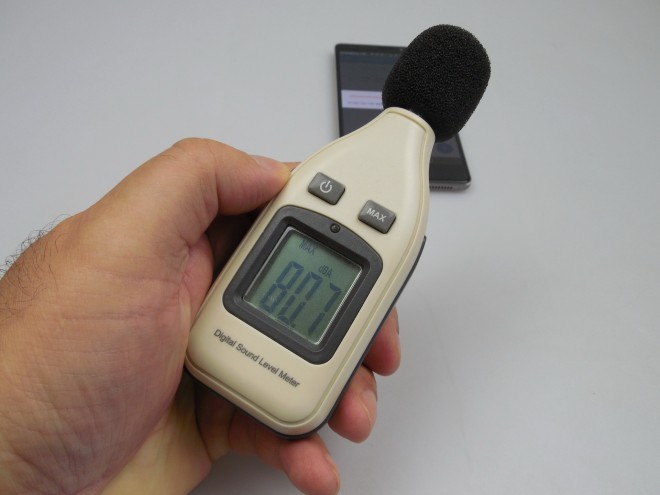
The same buds provide a loud, clear and crisp sound and good bass. FM radio is available here, too, with a minimal UI, an iOS style vibe and fast station finding. We did a decibelmeter test at the front and back and achieved 80.7 dBA, which is underwhelming a bit. The Huawei P8 had 81.2 dBA for example, while the OnePlus One got to 90.5 dBA and the Honor 6 Plus scored 81.9 dBA, so the speaker could do better.
Now, as far as the screen goes, we’re talking about a Full HD 5.5 incher, with an AMOLED On Cell panel of the 2.5D kind. We get 401 ppi density here and the On Cell thing means we get a layer of touch sensors embedded into the screen panel. Force Touch is also offered on the 128 GB model, letting you press the screen with various degrees of pressure in order to get commands through. This allows you to weigh light objects, zoom into pictures and interact with the UI in new ways.
The video app is minimal and has a file manager styling, plus it offers DTS support and not many other options. The viewing experience involves a good brightness, so-so sunlight behaviour, wide view angles and deep blacks. There’s a bit of oversaturation here, but you can solve that from settings. I didn’t feel the lack of a Quad HD resolution, since the screen seemed pretty crisp to me.
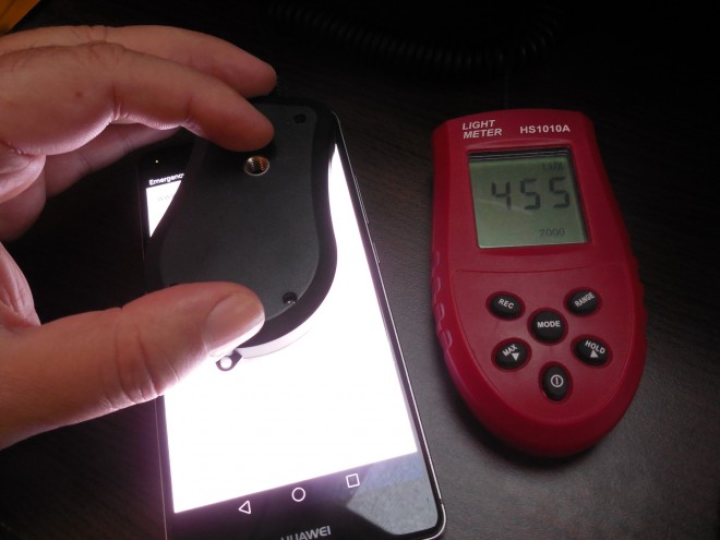
Pixels have a Pentile Matrix arrangement here and when we used the luxmeter, we achieved a value of 455 LUX on this screen, which is in the upper tier of smartphones. We beat the LG G4’s 432 LUX or the Huawei Honor 6 Plus’ same value. Huawei P8 was also inferior, with 346 LUX. Of course, there are still higher performers, like the HTC One M8, with 463 LUX, Galaxy S6 with 475 LUX with the manual slider brightness on, or the Galaxy S5 with 480 LUX.
From the settings you can tweak the color temperature (warm or cold slider), font and brightness and overall this remains a good screen. The camera is now the topic of discussion, so let’s see what it has to offer. The P8 and P8 Lite had great cameras, as did the Honor 6 Plus, so Mate S must also make a good impression. This phablet brings a 13 megapixel shooter with F/2.0 aperture and RGBW sensor, that includes an extra white pixel used to capture more light.
We’ve got a dual tone flash in the mix, optical image stabilization and a sapphire glass protection. Basically, this should be the same camera as the one of the Huawei P8, with an IMX278 sensor. The front camera is an 8 MP unit, with its very own flash. The camera app doesn’t start up very fast and we get the same UI as on the Huawei P8 and the P8 Lite, plus a few extra features.
On the left side there are the capture modes, including HDR, Best Photo (take multiple pictures, choose one), Document Readjustment, Super Night (30 seconds of adjusted exposure and shutter for great low light capture), All Focus (refocus), Audio Note (picture plus 10 seconds of audio), Panorama and Pro Camera. This is a novelty compared to other Huawei models we tested and it brings extra options for the photo capture.
We’ve got a grille, timer, autofocus, flash options and on the right side there’s a series of semicircles, in Lumia fashion. They let you tweak the white balance with a Kelvin slider, the focus, exposure, shutter (from 1/4000 to 8 seconds), ISO (up to 1600) and metering (matrix, spot, center weight). Then there’s Watermark as another capture mode and a bunch of straightforward settings.
This menu is oriented in portrait and includes the resolution (13 MP in 4:3 or 10 MP in 16:9), GPS tag, Perfect Selfie (lets you create a sort of selfie template, with beauty effects applied), Audio Control, Timer, Touch to Capture, Smile Capture, OIS, Object Tracking and functions associated to the shutter button and volume buttons. By the way, one can double press the volume down button in lockscreen to take a very fast picture by opening the camera app quickly.
Then there’s Image Adjustment, with options for saturation, contrast and brightness and I have to mention that there are 4 flash options available here. On the right side of the UI there are the filters, Time Lapse, Video capture with Beauty Mode, Full HD or HD and 2 stabilization options, as well as the Beauty shot and Light Painting. This mode draws traces of light using the passing cars’ taillights at night and also enhances the silky water of waterfalls. The front camera provides its own panorama, audio note, watermark and mirror modes and it offers 8 MP shots in 4:3 or 6 MP shots in 16:9.
It also does Full HD video. We tested the functioning of the camera and found it to focus fast, as well as auto sharpen pictures in some conditions. The zoom is fluid and there’s also an exposure slider that appears near the virtual frame. If you keep the screen pressed, you’ll see two frames that can be moved around to adjust focus and metering point.
Picture taking is fast, but the sharpening may delay it a bit. Now the gallery we took with this device involves shots from mid September, on a sunny day. Our captures were slightly below the Huawei P8’s in quality and there were some sun burnt shots. Colors were realistic and HDR was proved to enhance contrast in that picture of a cross. All Focus worked just fine, allowing us to refocus where we please, while the panorama was excellently detailed, crisp and fast. It had a resolution of 17152 x 3008 pixels.
Back to the regular capture (day time gallery here), some of the shots were a bit overexposed on account of the sun, but we did get some very nice closeups of a metal faucet, with an excellent texture rendered. Selfies were also great, with a good shade of blue for my T-shirt and nice skin texture. The HDR of a tree once again settle contrast quite well. Overall, focus and exposure were good and the colors of that playground we photographed were realistic.
Landscape shots did tend to lose some detail and speaking of details, we zoomed onto a butterfly, but the result was a bit grainy. I liked the colors and reflections of those toys we caught on camera at a certain point. Flower macros looked fine and overall I’d place this camera half a step below the Huawei P8, above the HTC Desire 820 and below a 2014 flagship like HTC One M8 and Galaxy S5.
The low light capture (gallery here) involved blurry indoor shots, a good flash, actually one of the most powerful flashes I’ve seen on a phone and we triggered a nice flower closeup at night thanks to it. Without flash, the camera doesn’t stick out in the dark very much. We tried out the light trail, being vaguely impressed and found that the Mate S can’t handle the street lights very well and that there’s a lot of reflection going on.
Super Night did the trick, turning night into day, but we’ve already been impressed by that on the P8. Videos were shot in Full HD, MP4, at 30 FPS and very low bitrate of 9.6 Mbps somehow. This triggered a poor quality video capture, which may or may not be the fault of the test sample we used. Exposure problems were also present during filming and the image wasn’t very clear. Lighting was bad, the image got curved when panning and stabilization was mostly lacking.
Once again, we used a test unit for our review, not the final model, which may be the problem here. Overall, this camera is about 10% inferior to the one of the Huawei P8 and one thing to remember are the closeups and very good selfies. Editing is done with some custom Huawei options, including rotate, crop, filter, adjust, graffiti, mosaic, label and watermark.
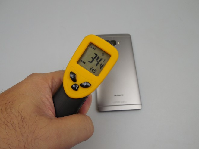
We move on to performance, where we did a temperature test and reached 34.9 degrees Celsius, after 15 minutes of playing the game Riptide GP2, which means there’s no overheating. The web browser on the Huawei Mate S offers medium speed and allows full screen browsing. The virtual keyboard is strangely spaced and I can’t say why it didn’t feel comfy. Thank God for Swype!
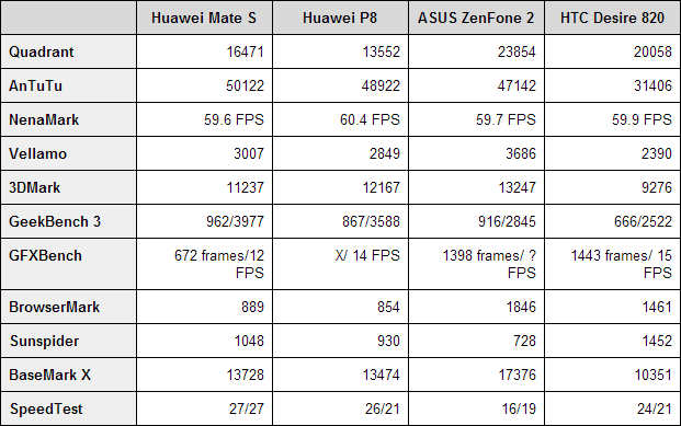
The phone section brought us Speed Dial, privacy protect features, a harassment filter and virtual HD call functionality. There’s also a pocket mode here and OK sound quality in calls, but the WiFi and cellular signal were lost quite often. I should also mention that lack of WiFi a and WiFi ac here as a letdown. Now let’s see the benchmarks! We compared the Huawei Mate S to the Huawei P8, ASUS ZenFone 2 and HTC Desire 820. The comparison involved a Kirin 935 CPU versus a Kirin 930, versus an Intel Atom Z3580 and a Snapdragon 615.
The first model had 3 GB of RAM, the second also 3 GB, the third 4 GB and the HTC merely 2 GB. These are the results:
Huawei Mate S wins 3 out of the 11 tests, but in front of the P8 it’s at 7 out of 11. The results are marginally impressive and we didn’t register any lag in the latest EMUI on board. Games such as Riptide GP2 with high end 3D graphics run just fine, Asphalt 8 included. The OS here is Android 5.1.1 with EMUI 3.1 on top, pretty much the same experience as on the Huawei P8.
The interface is minimal and flat, pragmatic and mature, without gloss and childish icons. There’s no app drawer, so all apps are placed on the homescreens. Multitasking involves thumbnails, much like in HTC’s Sense and you can flick up to clear the apps. If you keep the homescreen pressed, you’ll be able to set up wallpapers, widgets, transitions and layout as you please.
The dropdown area features the notifications, shown as a timeline, Quick Settings and if you keep the Recents button pressed, you can trigger a split screen view. Thus you can use two apps at the same time on the screen. The lockscreen features shortcuts to the Torch, Calculator and Camera if you swipe up and now we move to the Settings. There are tons of options here, including one that enhances the signal on a train.
Touch and Pay can be setup here, as well as smart unlock with a Huawei bracelet. Home screen style can be set to Simple, there’s Do Not Disturb and Security features, too. This is where we also set up the fingerprint scanner, that has a fast setup process and also fast and precise authentication. You can also use the sensor to take a picture, or answer a call or stop an alarm.
By the way, swiping on it allows you to move between pictures in the gallery. Voice Wakeup is another cool feature, letting you call the phone by a Nickname you previously set up. Then you say “Where Are You” and it begins to sing, light its flash and say “I’m here” in a loud feminine voice. This way you’ll never lose the Mate S under the bed again.
There’s also motion control with typical gestures like flip to mute or raise to ear to call. Then there are the famous Knuckle Gestures from the P8, in version 2.0. Now you can do video recordings of the screen by pressing two knuckles hard on the display for a bit. You known twice to take a screenshot and rotate a knuckle on the screen to cut a portion of it.
Drawing letters to open apps is available here as well and a double touch to turn on the screen too. Finally, one can set up the nav bar, one hand UI, dual window mode, suspend button (floating widget with virtual Android buttons), glove mode and touch disable mode. The preinstalled app list is filled with bloatware and includes the Google suite, Street View, Email, Phone Manager (accelerator, cleaner and power save), Notepad, Themes (with loads of customization), Calendar, Director Mode, Files, WPS Office, Facebook, Twitter, To Do Ist, Weather, Calculator, Recorder, Mirror, Magnifier, Hicare, Updater, Magic Tag, Flashlight, Vmall and Games.
We also showed you a bundled case cover in the video review, with the accessory being very hard to remove. One more thing: if you swipe down in the homescreen, you’ll see a search bar, just like in the case of the iOS spotlight. And now let’s see the verdict for the Huawei Mate S.
Here are the Pros:
- elegant design
- comfy
- bright screen
- OK battery, but not a record breaker
- good camera and selfie camera
- realistic colors
- nice Pro camera features
- no lag
- good use of Knuckles, gestures and fingerprint scanner for extra functions
And the Cons:
- slight distort at max speaker volume
- not very loud
- video capture is broken (test unit)
- some signal problems
- bloatware
- cool feature may begin to feel like gimmicks after a while
We give this smartphone a 9.4 out of 10 for design, a 9.1 for hardware and a 9.3 for OS and UI. The final grade is 9.26 out of 10 and you should keep in mind that this is the most elegant Huawei phone ever, the best looking model, with that 2.5D glass upfront and it also makes good use of knuckle gestures and fingerprint scanner. The selfie camera is excellent and the screen is bright.
Drawbacks are the GPU and maybe the filming, but I’m sure the final version has that fixed.


