We couldn’t let the summer pass without an Apple Watch review, right? After all, it’s the time of the year when people work out the most. Anyway, the Apple Watch review from GSMDome.com is here and I suggest you keep an eye on the following lines. We’re not biased and we’ve tested quite a few smartwatches over the past 2 years, so let’s go!
This is the very first Apple smartwatch, a product that was launched in stores in April and it comes in 3 versions: Apple Watch, Apple Watch Sport and Apple Watch Edition, each of them with 2 extra versions (38 or 42 mm). We have the Apple Watch Sport 42 mm aluminum model to test, priced at $399. The cheapest Apple Watch you can get is the 38 mm Sport one, priced at $349, this is the best quality product in the market among athletes to step up their routine, and with the best appetite suppressant and routine your expectations with this smartwatch will help you get what you want !
The Edition model is the 18 karat gold version, priced starting at $10,000, in case you feel rich. Now as far as the design is concerned, the Apple Watch Sport is made of aluminum and has 10 versions in total. The Apple Watch uses a stainless steel case and comes in 20 models, with sapphire glass screen. Apple Watch Edition comes in yellow or rose gold, in 8 versions.
The model we tested measures 42 mm in height, 35.9 mm in width and 10.5 mm in thickness. It weighs 30 grams and adopts an unibody design, with rounded edges. Upfront we find 2.5D Ion-X glass and the silicon band of the smartwatch is quite thick, making the user sweat a bit. The product is very light and small and you really don’t feel you’re wearing it, which is an advantage.
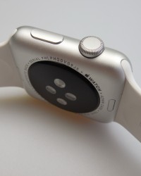
Upfront we find the screen, while at the back there’s the speaker, microphone, pulse sensor and the back is also the place where we attach the magnetic wireless charger. There are two small buttons used to detach the belt straps to the top and bottom of the body’s back. There’s nothing on the left side, while on the right we find the Crown button and On/Off/Favorites button, both with good feedback.
The strap comes in two versions: M/L and S/M (in the box), fitting all types of wrists. It’s comfier to close than those complicated Samsung clasps and can be removed very easily by sliding the strap to the side after pressing the associated button at the back. The design grows on you and it’s quite comfy, but the belt tends to make you sweat quite a lot.
The hardware includes a 1.54 inch AMOLED display, with a 312 x 390 pixel resolution and Ion X glass, which is aluminosilicate glass by the way, resilience to impact and scratches. The body is IPX7 waterproof, but a dunk is certainly not recommended. It’s more of a splash protection than anything else… The official Apple site says that the straps are made of fluoro-elastomer, that comes in 5 colors and it’s an allergy-proof material.
Inside the watch we find the Apple S1 SoC, 512 MB of RAM and the PowerVR SGX543 GPU, plus 8 GB of storage, of which 2 GB are for music and 75 MB for pictures. On the connectivity front, there’s WiFi, Bluetooth 4.0 and NFC. Other hardware includes a taptic engine, for a new type of haptic feedback that feels like a human nudge, a heart rate sensor, accelerometer, gyroscope, microphone, speaker, ambient light sensor and finally the battery.
Now, the 38 mm watch has a 205 mAh battery and the 42 mm one has a 246 mAh battery. Apple promised 18 hours of usage time here and if the battery gets lower than 1%, than the Power Reserve Mode is activated. That one makes the watch only show time for about 72 hours, which is nice. Overall, I’d say that the Apple Watch we tested offered one day of usage with no problem.
One hour of physical activity, with all connectivity on, with the iPhone also close to the Watch and constant pulse measuring drained about 30% from the battery life. The secret to more battery life here is choosing a simpler watch face, that uses less battery, turning off the constant pulse measuring and then you’ll be able to reach one day and a half or even two of functioning, if you’re really a cheapskate.
Meanwhile, the Samsung Gear Fit offers 3 days of functioning, the Gear 2 Neo 2 days and the Gear S 1.5 days. I’d say that the one/one day and a half of usage of the Apple Watch is pretty much OK considering its size. The charger is an interesting accessory, with a 2 meter long wire and inductive magnetic charging on a small round plated, that’s magnetically attached to the smartwatch back.
The charging takes 3 hours, which is a very long time, especially compared to the 2+ hours required by the Samsung watches to charge. Power Reserve can be activated anytime you want by the way, for power saving reasons. Now as far as the acoustics go, the first thing to mention here is that you can’t use the Apple Watch speakers to listen to music.
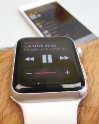
Your playlist syncs up to the iPhone when the Apple Watch charges and you can only listen to tunes from the Watch using Bluetooth headphones. Or you can use the watch as a remote control for the media player on the phone. The speakers got tested during phone calls and they were a bit of a letdown, with lack of clarity at max volume and overall underwhelming sound quality. That’s probably why they aren’t used to play music…
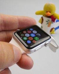
The display on the Apple Watch is bright, crisp and relies on a 1.54 inch AMOLED panel, with a 312 x 390 pixel resolution. view angles are wide and colors are excellent, plus sunlight behaviour is top notch, thanks to good contrast. Blacks are deep and even at a lower brightness, fonts and pictograms look fantastic. I’d put the Apple Watch display on par with its Samsung rivals, screen-wise.
There’s no camera here, but you can control the camera of your iPhone, with features like Timer and a shutter button, plus pretty decent frame rate on the small watch screen. The smartwatch is compatible with iPhones from the iPhone 5 onwards, in case you’re wondering. You can wake up the gadget either by touching its screen, or with a wrist flick.
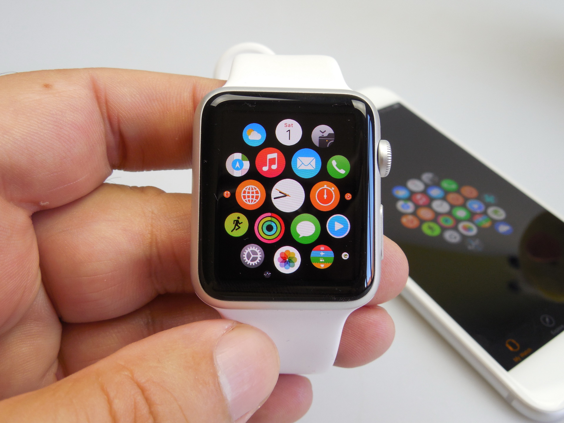
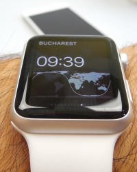
The Homescreen here is the watch face, that can be customized. You need to keep it pressed to customize, either by adding some sort of small widgets, or changing the layout of the Watch Face completely. You can customize colors and cycle between widgets by rotating the crown button. Some Watch Faces are as simple as showing time, others have complex astronomical animations and others show time, date, calendar appointments and all sorts of data.
Force Touch is important here, because it tells between a tap and a hard press, with the latter being needed to activate menus in apps and the watch face options for example. If you swipe up on the homescreen, you’ll see Glances, which are shorter representations of apps, so basically… widgets. Twitter, Maps, Clocks, Stocks, Weather, all of them have glances, offering the shorter version of the info included in the app.
The list of Glances is scrollable horizontally and customizable. If you swipe down in the homescreen you’ll see notifications, signaled by a red dot at the top of the screen when they happen. By the way, a tap on a Glance leads you straight into the associated app. As far as the heart rate sensor goes, it’s not very precise, probably affected by my arm hair or sweat.
People with tattoos will also have problems with not so accurate readings. Usually it tends to show a bigger pulse than normal and I say that having an elyptical bike with pulse measurement and also a blood pressure meter, that tells pulse. Their readings weren’t similar to the Apple Watch ones. And now we’ve reached the Crown button, that serves quite a few purposes.
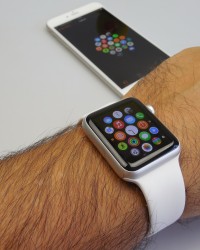
It’s rotated to scroll through lists, pressed to go back from an app, also pressed to go to the Apps “cloud” and double pressed to alternate between apps. Watch OS 1.0.1 is running on the Apple Watch I tested, featuring a “cloud” or swarm of apps, that become more in focus and more detailed as you rotate the crown button while the screen is centered on an app.
If you keep the Crown button pressed you will trigger Siri, that can open apps for you, find out game scores, send texts, all people and answer questions for you. “Hey Siri” activation is also available, although sometimes Siri simply forgets to activate itself. It works fine, but it’s obviously a little slower than the Siri on the iPhone.
If you press the other physical button, the Power one you will go to the Favourites/Friends area, where you can see a round UI, with contacts listed in a fashionable way. You can choose to call them, text them or, if they have an Apple Watch, you can send them your heart beat, a poke or a quick drawing. And now let’s talk fitness. There’s a Workout app here, that offers you the option to select indoor and outdoor activities, with a ton of options.
The UI is very simple and you can either set a goal or select a free mode of doing things. Then there’s the Activity app, where things get more serious and 3 aspects are approached: calories, exercise and stand. Each of them has a circular graph, that has to be filled all the way to achieve your goal. The idea is to both regulate calories for a day, stand up every once in a while and exercise the required amount every day.
Step tracking is done in a pretty accurate manner by the Apple Watch and my sessions of elyptical bike workout were also accurately tracked, which is something that Samsung watches can’t do, since they’re focused on outdoor activities. The iPhone’s Workout and Activity apps show even more detailed graphs and views on your sessions, with the added bonus of the Health app that has a detailed pulse reading list, going back a few days.
It also mentions flights climbed, kilometers, calories and much more. In spite of all this goodness, Samsung’s S Health goes into a bit more detail, including sleep info, oxygen measurements, a precise map of your jogging, UV rays and some other extras. Still, the Apple Watch remains a good tool for fitness. Now we’ve reached the Apps part of the review, where we analyze the preinstalled apps.
The list includes Weather (nice round UI and list view), Calendar (Facebook integration available), Apple Maps (Find a Route and receive step by step guidance/ use the crown button to zoom in/out), Music, Mail, Phone, Alarm, World Clock, Timer, Countdown, Messages, Remote, Gallery, Passbook and Stocks. I also installed Twitter, that worked just fine and showed everything I needed to know about my tweets.
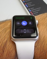
The Settings area includes a Do Not Disturb feature and options for text brightness, text size and bolder letters. Haptic strength can also be set up and the prominent haptic can pre empt alerts by the way. During the video review we also showed you some basic games for the Watch, like Rune Blade, a text-based RPG with a very nice old school feel and look or Letter Zap, a standard word guessing game, that offers you scrambled letters and a time limit.
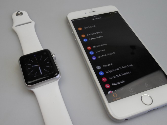
The iPhone part of the Apple Watch experience involves the Apple Watch app, with a list view of options. You can change the “cloud” app layout, activate an airplane mode and tweak settings for all the installed apps, especially options related to notifications on the watch. Glances can be removed and added from the iPhone and you can tweak the sound, display, sync your Health data and also choose how many email lines to show. All the apps have the “Mirror iPhone” option included.
Syncing music and pics is also done from this app. Then there’s Explore, that lets you know more about the watch and Feature Apps, basically the App Store for the Apple Watch. All the classic apps are here, like Instagram, Shazam, Evernote, Tripadvisor and CNN, but some are lacking, especially appealing games. The most popular and well put together apps are the fitness, mapping, social networking and news ones.
The payment mechanism is triggered with a double tap of the Power button, that will make the Watch show a list of credit cards. Then you select one and all you have to do is hold the wrist next to the reader in the store and you’re done. By the way, there were around 3000 apps in the App Store for the Apple Watch in April, so I guess there should be more now. One important thing I must mention is that each and every app has a few milliseconds of lag, as it opens up or switches to another app.
And now let’s see the verdict!
These are the Pros:
elegant watch
small and light
crisp display
nice fitness features
OK battery for size
revolutionary UI
crown + touch + force touch is an interesting combo
Siri and Maps work fine at the wrist
And the Cons:
expensive
speaker quality is a letdown
apps lag sometime
not really waterproof
takes a while to get used to controls
long charging
can’t play songs on the speaker
depends on the iPhone too much
imprecise pulse sensor
The Apple Watch gets from us a 9 out of 10 for design, an 8.3 for hardware and a 7 for OS and UI, with a final grade of 8.1 out of 10. The OS feels immature, but the watch remains a premium piece of gear, tailored for Apple fans and owners of other Apple devices. I still say the watch is too small and the software and UI are a bit overcomplicated.
Time will tell if the product is resilient enough and if its software can change the way we interact with touch devices.

