With the number of mobile phone users lately growing, it’s only natural that the most important websites adapt to the growing demand of mobile browsing. It’s also the case of Google, who just improved the looks of its Docs and News sections.
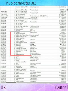
Spreadsheet views in Google Docs for Mobile shows better results than the old “one column at a time” alternative. Still, there is no editing possible and scrolling can get slow once a spreadsheet has more than a hundred rows.
As a result, Google should look slightly better on S60 series phones and on QVGA screens, although Google still has room for improvement. Many handsets out there are equipped with internet connection possibilities and people actually use it. Big shock! Websites, adapt quickly!
[via: allaboutsymbian]


