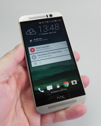
HTC One M9 is the 2015 flagship phone made by HTC, announced at MWC 2015, on March 1st. This model is priced at $649 in USA and it has been received with moderate warmth all over the world, pretty much like the HTC Nexus 9 tablet. Now let’s see what we had to say about it.
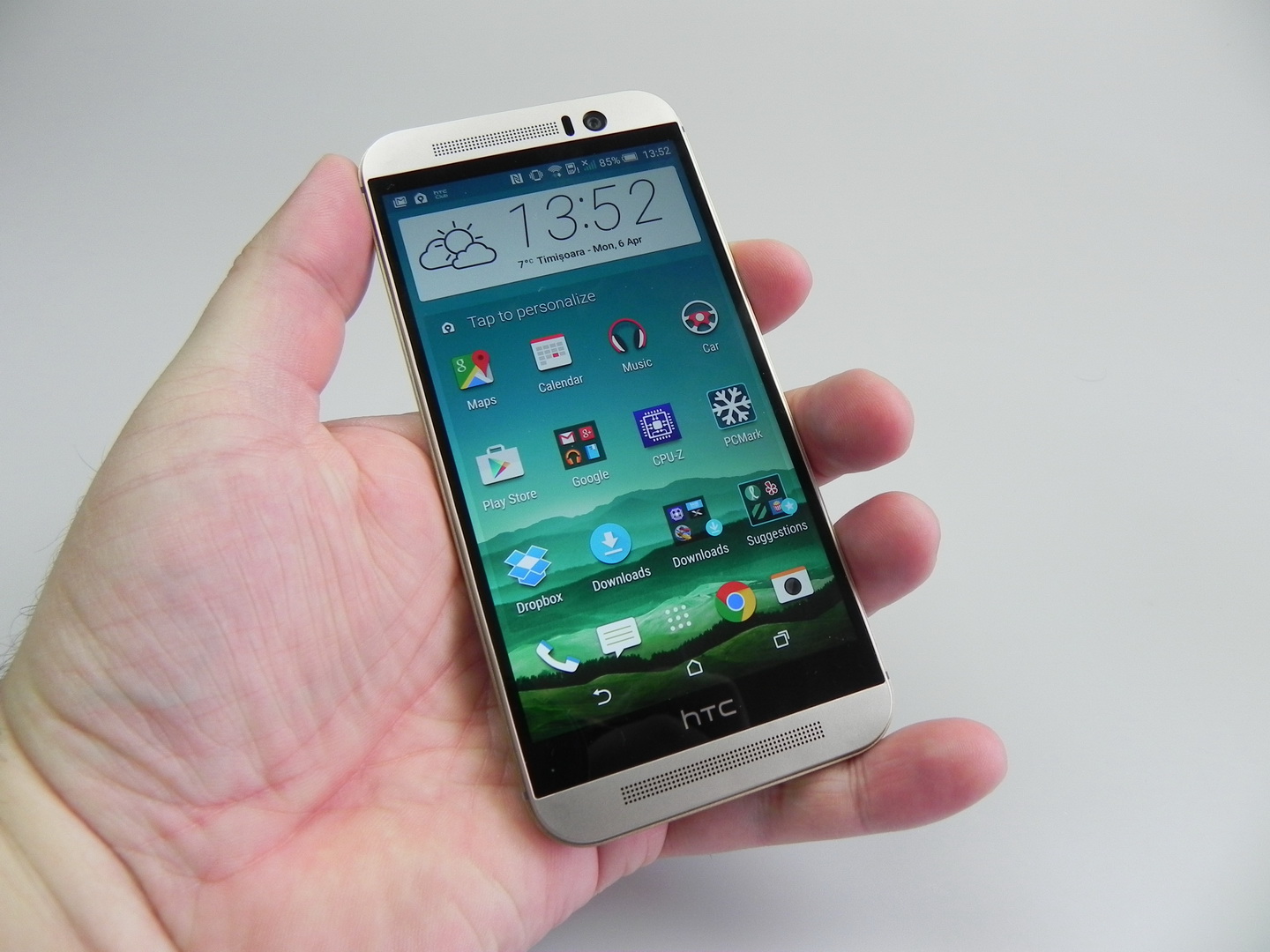
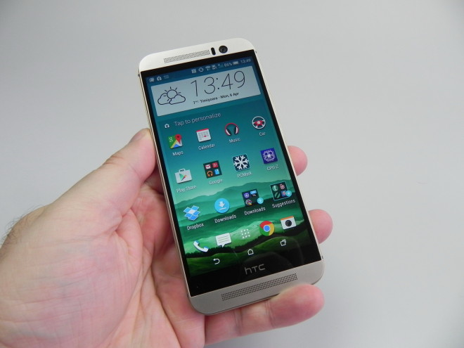
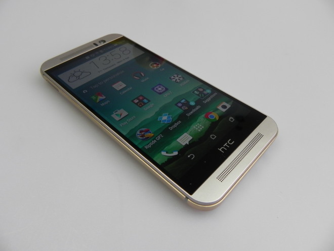
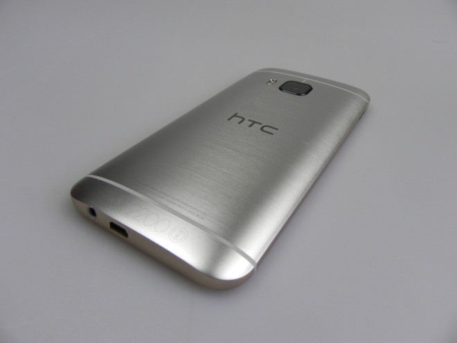
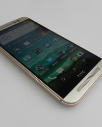
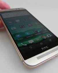
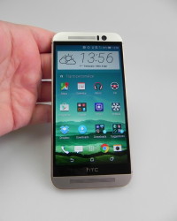
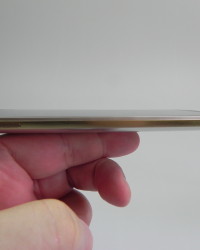
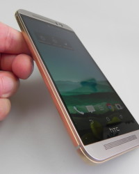
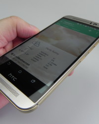
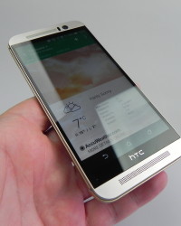
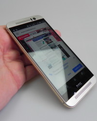
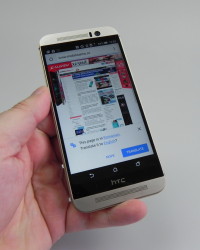
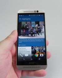
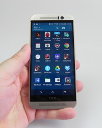
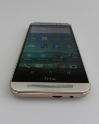
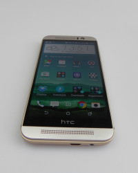
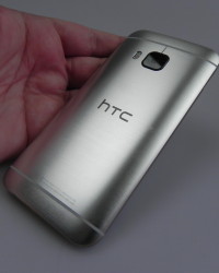
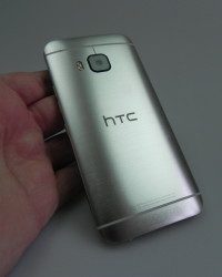
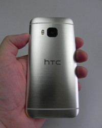
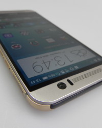
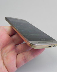
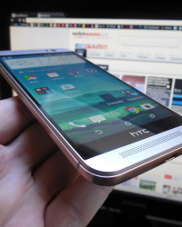
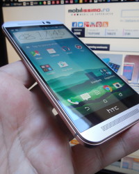
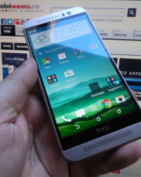
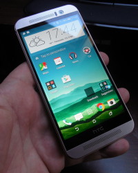
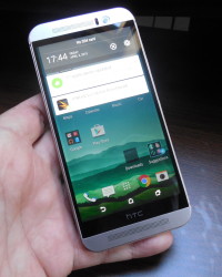
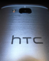
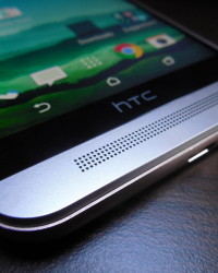
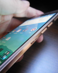
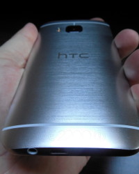
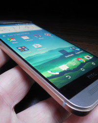
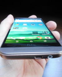
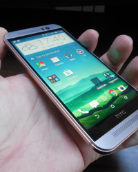
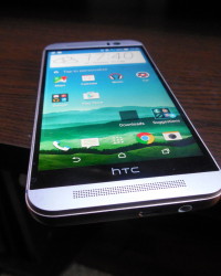
As far as design goes, HTC One M9 adopts an unibody metal approach, very similar to the one of the M8. The smartphone is a bit heavy for a 5 incher, at 157 grams, which is 3 grams lighter than the M8. It measures 9.6 mm in thickness, so it’s also 0.2 mm thicker than the HTC One M8. Our test unit had a silver back and copper gold sides, in keeping with the two tone approach HTC implemented here. The design feels layered and that extra bezel serves for better grip.
It’s like the phone has a bumper case around it, made of metal. The extra layer of metal around hangs on your fingers and increases grip, as we mentioned before. The phone does look nice and it’s made of premium materials. It sits comfortably in the hand and it offers easy one hand usage. It’s still a pretty long device, having pretty much the same length as the 5.5 inch LG G3, but it’s less wide.
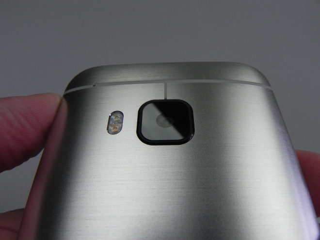
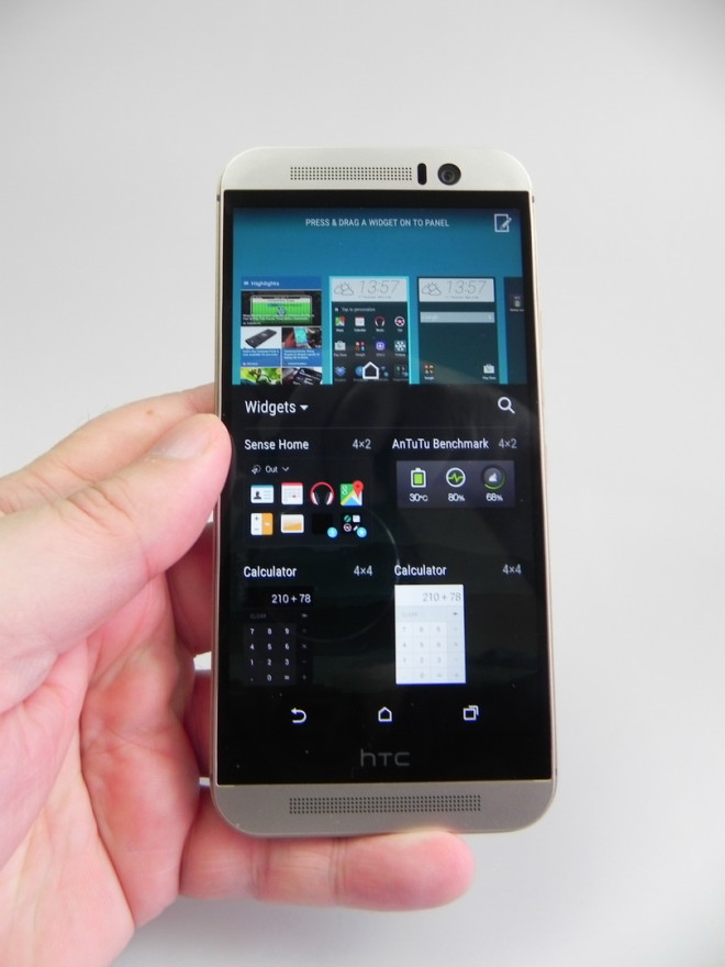
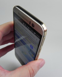
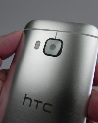
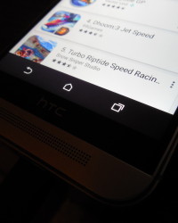
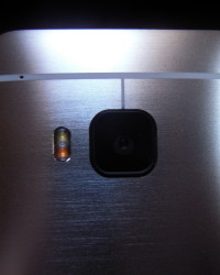
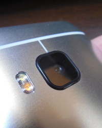
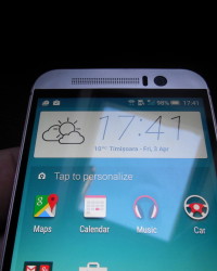
The One M9 is also pretty solid, so it doesn’t feel like it could break apart if dropped. At the front we find BoomSound speakers, sensors, the selfie camera, notification LED in the earpiece and the famous useless black bar labeled “HTC”. That area supposedly covers some hidden components. At the back there’s the main camera, with a dual LED flash and microphone, as well as plastic antenna cutouts and a sapphire glass protection for the camera.
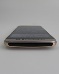
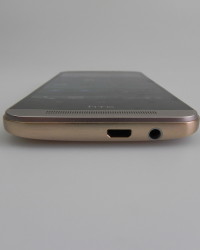
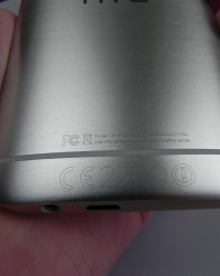
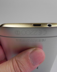
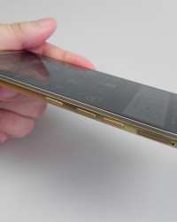
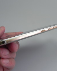
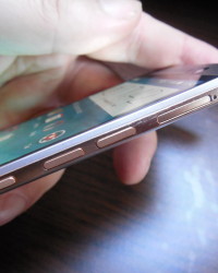
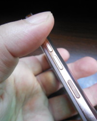
At the top we’ve only got the infrared emitter, while at the bottom rests the microUSB port and audio jack. To the left you can find the nano SIM tray, while on the right there’s microSD card slot, that can be opened up with a special metal key, like the nano SIM tray. Also on the right there are the volume buttons and On/Off button, the latter moved from the top.
It happened to me pretty often that I would press the volume down button instead of the On/Off one, which is a bit of a bummer. The new edges make the handset seem thinner and overall this design is a premium one and involves minor changes from the M8. There’s still that wasted space below the display, where you could put touch buttons, if you wanted to save space on the screen, but nobody seems to want that.
So, the design is pretty much OK, but also massive. Moving on to the hardware, HTC One M9 provides a Super LCD 3 display, with a Full HD resolution, just like the predecessor, only this time also offering Gorilla Glass 4 protection. Inside the handset there’s an octa core Qualcomm Snapdragon 810 processor, with 4 cores of the Cortex A53 kind, clocked at 1.5 GHz and 4 cores of the Cortex A57 kind, clocked at 2 GHz.
There’s an Adreno 430 GPU on board, 3 GB of LPDDR4 RAM, 32 GB of storage and a microSD card slot that supports up to 128 GB extra storage. We’ve got a 20.7 megapixel back camera with dual LED flash and a front 4 Ultrapixel shooter. On the connectivity side, we’re completely covered, with the likes of WiFi 802.11 a/b/g/n/ac, DLNA, WiFi Direct, GPS, NFC, LTE and Glonass. There’s also infrared, Bluetooth 4.1, FM radio, microUSB 2.0 with MHL and moving to the other features, there are stereo speakers included here, with Dolby tech and a 2840 mAh battery (10.79 Whr), compared to the M8’s 2600 mAh unit.
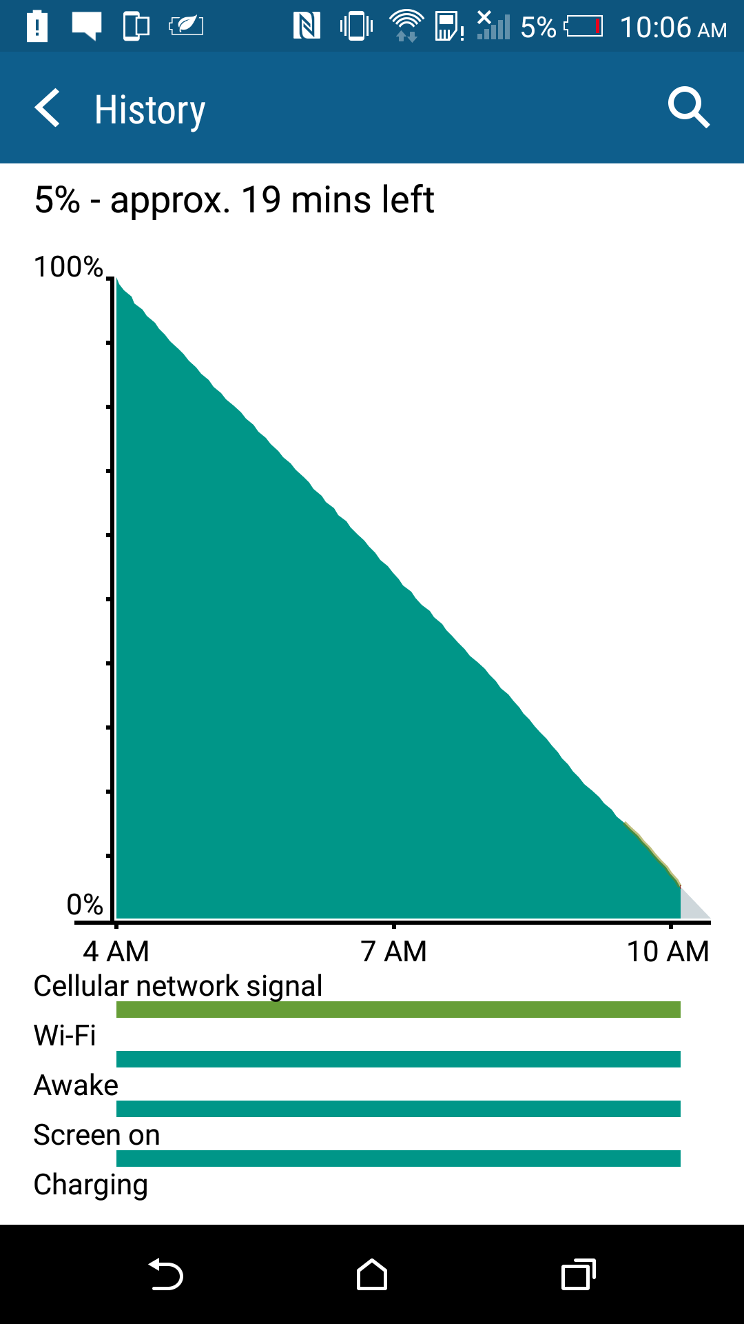
On paper the battery provides 400 hours of standby time or 25 hours of talk time. In our test, that involves HD video playback with WiFi on and brightness at 50%, we achieved 6 hours and 9 minutes of HD video playback. The M8 offers 10 hours and 15 minutes, while the iPhone 6 offers 11 hours and 30 minutes, so it’s safe to say we’ve been let down.
We also performed a PCMark test, that came out with 4 hours and 57 minutes of continuous usage. OnePlus One offers 5 hours and 15 minutes of usage in the meantime, in the same test and the Galaxy S6 achieves 7 hours and 6 minutes, so we’re not doing fine either in here. Overall, the battery is unimpressive and a bit of a letdown. The charging takes 2 hours and 20 minutes for the HTC One M9, while the Galaxy S6 took 1 hour and 10 minutes. The M8 took 2 hours and 20 minutes, so the evolution is quite small.
In the Settings area you’ll find Power Saving features, like CPU Power Save, Reduce Brightness, Turn off vibration and Data Off in Standby. There’s also Extreme Power Saving, that turns off certain features and connectivity aspects and offers access to basic functions, like phoning, text and email, as well as reduces brightness, turns off vibration and notifications.
UI elements are shown as big tiles and this option was also present on the HTC One M8, so it’s not new. Then there’s Sleep Mode, that has the data off in long periods of inactivity. Overall, I’d say the battery is a letdown. As far as acoustics go, there are dual stereo BoomSound speakers here, now with Dolby technology as an extra. The music player remains simple and without an EQ, but it has a nifty visualizer and FLAC support. Music is organized in Recently Played, Artists, Albums, Songs, Playlists and Folders.
The Settings only include Album Art, Artist, Photos and Lyrics. The actual listening experience involves a loud and clear sound, good bass, war sound, good high notes and overall a nice musical experience. The Settings only include a HTC BoomSound button, that switches from Music to Theater mode and viceversa, slightly tweaking percution and volume on the way.
The bundled headphones are pretty much the same as the ones that came with the M8 and they’ve got a tangle free wire, small remote, they’re comfy and provide good isolation. The bass is simply crazy here and the headphones are very loud. The sound is clear and you can get even more bass with the Dolby/BoomSound option from the Settings.
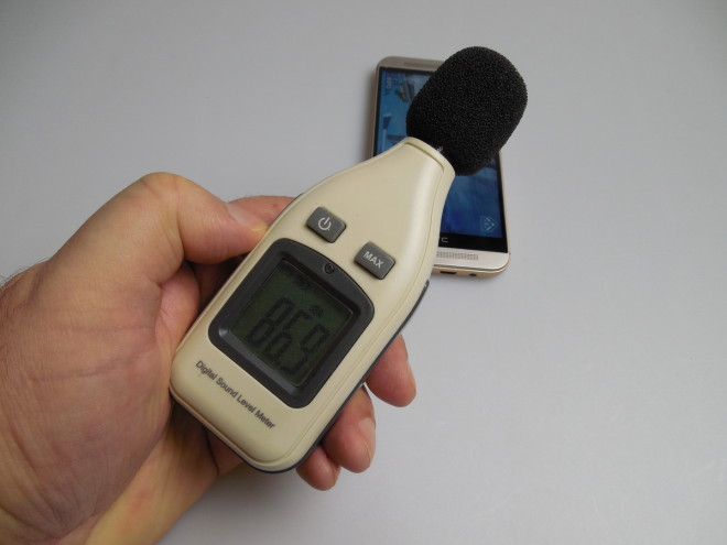
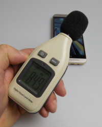
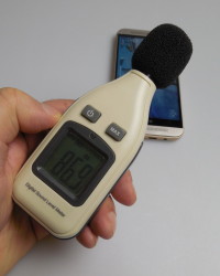
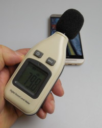
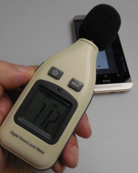
There’s FM radio with fast reception in the mix and in the decibelmeter test we initially got a result of 78 dBA, but the test sound we used was automatically turned down so it wouldn’t damage the device. Anyway, with the music and gaming on we got to a volume of 86.9 dBA, which would be impressive, if we didn’t know other higher results. For example, the BlackBerry Passport reaches 95.2 dBA, but it suffers from distortion.
Meanwhile, HTC One M9 has a clear sound even at the highest volume. By the way, the Galaxy S6 also achieves a higher value, at 89 dBA and overall I felt that the HTC One M8 had slightly better speakers than the HTC One M9.
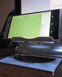
Now let’s discuss the display. What we get here is a Super LCD 3 unit with a 5 inch diagonal, Full HD resolution and the same panel as last year, this time with Gorilla Glass 4 protection. There’s no video player, so we have to make use of the gallery to play videos. Luckily, it supports, AVI files, MP4 files, Xvid, MKV and WMV files.
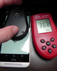
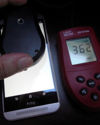
There are no subs offered here, though. The actual experience is crisp, bright, vivid and oversaturated a bit, plus the black isn’t deep. The view angles are wide, but sunlight behaviour is poor. I had the chance to see this model next to a Nexus 5 and it was only about 10% better in sunlight, which is poor. The pixels are of the RGB Stripe kind and the brightness we measured was a measly 362 LUX units, on two separate versions of the M9.
The HTC One M8 had 463 LUX, iPhone 6 got 570 LUX and Galaxy S6 473 LUX. This is strangely weak, making us think of a bug of something. In the Settings area we find a Glove mode, font size and Motion Launch, that offers the usual double tap to wake and other such functions. If you swipe left from the standby screen you’ll meet the widget panel, while a swipe right takes you to BlinkFeed.
Overall, this screen was a letdown, just like the battery and its bezels aren’t slim at all by 2015 standards. We’re obviously going to address the camera as well, considering HTC has given up on the back Ultrapixel shooter and moved it to the front. There’s a main 20 megapixel camera here, with Toshiba sensor, 1.12 micron pixels and the sensor size is 1/.24 inches (CMOS).
We’ve got F/2.2 aperture, a 27.8 mm lens and sapphire lens cover. There’s no optical image stabilization and the native aspect is 10:7. At the front there’s a 4 Ultrapixel camera, with 2 micron pixels, F/2.0 aperture and 26.8 mm lens, basically the one from the back of the M8. The UI feels exactly like on the M8 and sadly the camera app doesn’t start up very fast.
Focus is also not fast, but the picture taking speed is OK. On the left side of the UI we find the flash options and capture options, like Auto, Manual, Portrait, Landscape, Text, Macro, Night and HDR. The Manual mode brings up a few extra options, like white balance, exposure, ISO, shutter speed, focus, all of them offered as sliders. The video options include normal, slow motion and Full HD at 60 FPS. ISO goes up to 1600 and you can tweak the exposure and white balance even without manual mode on.
The Settings include Crop (16:9, 1:1 and 10:7), Make Up, Auto Smile Capture, Voice Capture, Timer, Touch Capture, Lock Focus During Recording, Continuous Shooting, Review Duration, Self Timer and resolution. The resolution is 5376 x 3024 pixels (16:9), or 4672 x 2624 or 3808 x 2144. The Image Adjust options include Contrast, Sharpness and Saturation.
Video Quality options include 4K and Full HD and finally we’ve got grid, geotagging, shutter sound and volume button options. On the right side of the UI there’s the shutter button, video shortcut and gallery shortcut. Also on this side there are the main capture settings, like Selfie (with sub options like Auto HDR, portrait, timer, exposure, white balance, crop, beauty slider, auto selfie, voice selfie and Full HD capture), Panorama, Bokeh, Photo Booth and Split Capture.
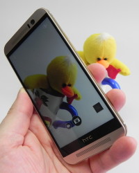
Bokeh is the famous effect that focuses on an object foreground and blurs the background. The subject must be at 10 to 60 cm for this to work. Photo Booth takes a series of shots within a set frame and split capture uses both the front and back camera for a shot. Zoom is fluid here and if you keep the screen pressed you will lock the AF and AE.
Now we move on the gallery, that features over 200 pictures, since we did a thorough test of the camera. You can find day time pictures here. They were taken first on a sunny day and you can see we’ve got realistic colors here, but also a few burnt pictures, because of the sun. There’s a white-ish hue on top of the images sometimes, for unexplained reasons. The panorama is pretty wide and looks OK and overall shots are crisp and offer a good level of detail during the day.
We’ve got that macro with a tiger toy and even played with the Bokeh effect a bit. The HDR samples include one with a blue graffiti, that serves to decrease the exaggerated brightness of the sun. We also tested the maximum zoom on the same graffiti, to disappointing results, since there’s a certain quality loss here. The second HDR, the one of the green and blue toy triggers an unrealistic white hue.
Once again, colors are generally good and macros are satisfying. The HTC One M9 takes very crisp selfies, being pretty much on par with the Galaxy S6, but not more. All the details look good in said selfies. We had a second gallery, one taken on a cloudy day and indoors, during an auto show. Some of the pictures were unexplainably white and some car images were blurry. Still, cloudy day shots were fine.
We ended day time capture with cherry blossom shots, that looked fine. Then came the most disappointing test, the low light one. We took a few snaps at night, only to find washed out colors, poor zoom, very weak focus and stabilization and poor white balance and exposure. It’s my personal opinion that in low light the HTC One M9 even underperforms when compared to the HTC One M7.
As far as videos go, we usually caught Full HD videos, at 29 FPS and 20 Mbps. Colors were good, stabilization was poor, but the camera couldn’t handle the wind well. That was the first video and the second one was a 4K clip, with 42 Mbps bitrate, crisp image, OK focus, good details, realistic colors and even OK stabilization. The third video we caught was a Full HD 60 FPS one, with 21 Mbps bitrate, burnt image and poor stabilization. The fourth video was all about slow mo, with 720p resolution and 12 Mbps. It looked OK, but it wasn’t anything special.
Video 5 was burnt and video 6 was a stabilization test, that let us down. Even the digital stabilization of the iPhone 6 is better… Video 7, the one with the cars had good acoustics, poor exposure and pixelated the image at an extended zoom. Night time video capture was horrific, with 19 FPS and it almost looked like 480p or VGA capture.
There’s poor lighting handling, poor details, but OK focus and acoustics at night. Sadly, HTC One M9 offered us the weakest flagship phone camera in years. We blame it on a potential hardware or software bug, otherwise we simply can’t explain it. Aside from the macros, good colors and a few day time shots, there’s nothing to write home about. We’re pretty much below the quality of the HTC One M8 here, but at least the selfie area performs well.
You can mess around with pictures and create Zoes, with a variety of backgrounds tunes and filters. You can select the preferred pictures and videos and turn them into a short clip summing them up, a Zoe. Each album from the Gallery has its own mini Zoe at the top. You can also turn pictures into Themes, by taking colors from them and generating icons and wallpapers and finally a theme.
You can then edit textures, colors, icons, sounds and use a few templates. The Photo Editor that HTC offers is pretty complex and it includes filters, tools, red eye remove, frames, draw, effects, shapes, elements and more. We’re done with the camera and now we’re discussing temperature. HTC One M9 initially suffered from overheating, in prototype phase, at MWC 2015 and then some reviewers saw it reached 55 degrees Celsius.
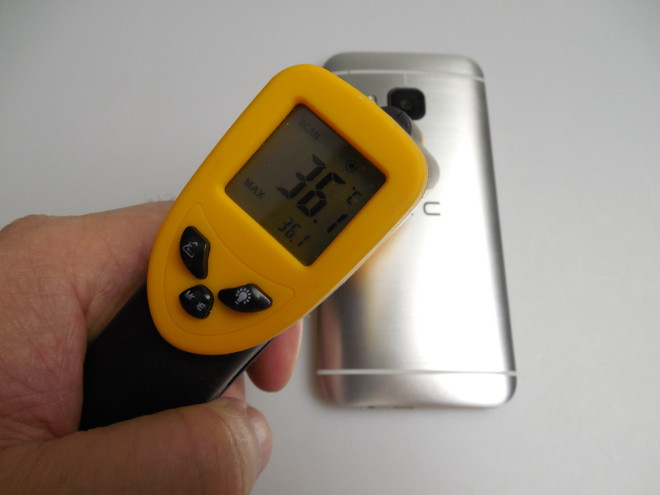
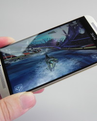
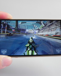
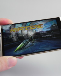
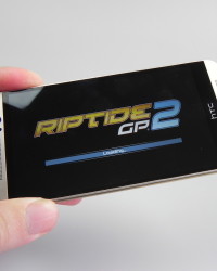
HTC and Qualcomm worked on that and brought the temperature down by thermal throttling. Now, after playing 15 minutes of the game Riptide GP2 we only reached a temperature of 36.1 degrees Celsius, which is OK. However, when we did a BaseMark X benchmark, it got blocked at some point and then we checked out the device’s temperature with the CPU-Z app, only to see it reach 48 degrees Celsius.
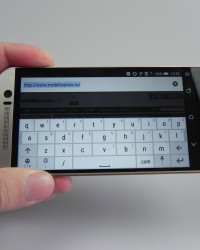
I should also mention that after a long session of photo taking the device got a bit hot. Now we move on to the browser, which is Chrome in this case, with a so so speed. The keyboard offered here is strangely not comfy, being spaced too big for the 5 inch diagonal. You can change it, if you want and use a Swype style system. The phone calling experience was great, with a huge volume and everytime I spoke on the phone, it felt like I had the speakerphone on.
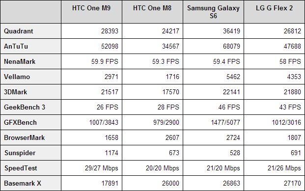
Signal is good, we’ve got speed dial and the sound was crisp. There’s also a large dial pad in the mix here. Now let’s see the benchmarks! I decided to compare the HTC One M9 with the HTC One M8, Galaxy S6 and LG G Flex 2. It’s a battle of the Snapdragon 810 vs the Snapdragon 801, Exynos 7420 and again the Snapdragon 810. Here are the results:
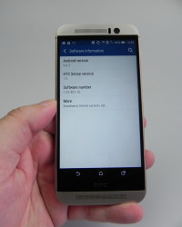
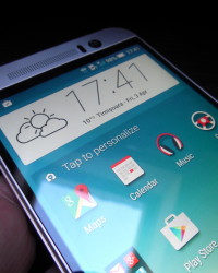
HTC One M9 wins only 2 out of 11 battles and 7 out of 11 in front of the HTC One M8. The benchmark that stands out is the SpeedTest, with huge scores. The handset doesn’t suffer from lag and runs 3D games perfectly. Now let’s dissect the OS and UI. As usual HTC Sense looks great and this time version 7.0 is applied on top of Android Lollipop. The main novelty here is the presence of HTC Sense Home, a special widget that adapts to your behaviour.
The widget chooses the apps that you are most likely to use at certain times of day and places. There are special apps for use at home, at work or outside. It all adapts to your habits and apps are moved around. BlinkFeed is now able to suggest places to have lunch at, with recommendations also popping up on the lockscreen as you leave work around lunch time.
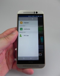
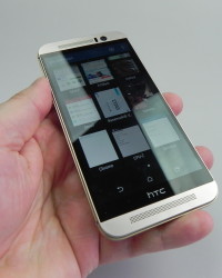
The Themes are also a novelty, that has already reached HTC One M8 via an update. There’s a store filled with beautiful themes and the option to create your own and upload it. Any picture can be turned into a theme and the degree of customization is huge. No other phone maker offers so many customization options right now. Multitasking is still available in pure HTC way, with 9 thumbnails on the screen, that can be closed via swiping up.
You can also pin an app to the screen in order to have it stay on the display at all time. The Material Design is felt through icons, fonts and some color combos here. BlinkFeed hasn’t changed much from last year and it’s available at the leftmost side of the screen, with compact tiles, news and social networking feeds, including Zoe.
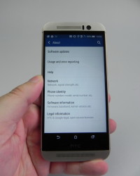
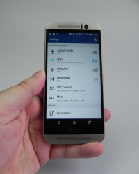
The dropdown area includes notifications, cards from Google Now, Quick Settings and moving on to the Settings area we find a minimal and clean interface. There’s a HTC Mini remote option, lots of personalization options (change launcher, change wallpaper, navigation buttons, colors, ringtones and more). There’s a search bar in the Settings area to help you find stuff easier.
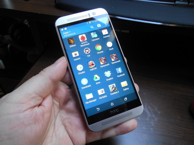
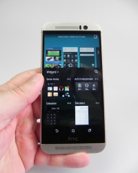
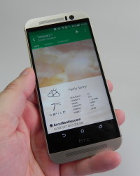
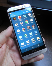
The app list features a grid of the 3×4 kind or 4×5 kind and the scrolling is vertical here, not horizontal, like on most handsets. If you pinch the homescreen you’ll see a bunch of good looking widgets and weather still looks hot in the HTC version. Overall, we like the sexy UI and customization and now let’s see the preinstalled app list.
There’s Mail, Calendar, Maps, Gallery, Zoe (with social networking features now), Cloudex, the Google Suite, Facebook, Car Mode, Scribble (draw, hand write, use a variety of pens and brushes, stickers). Then there’s Polaris Office 5, File Manager, Skype, Dr Eye, Calculator, Weather, Voice Recording, Dot View and HTC Community. Clean Master and Fun Fit are here, too with the latter having a pretty strange and hipster-like interface that I didn’t like. Peel Smart Remote will take care of the infrared connectivity and TV remote features.
I could say that the HTC One M9 suffers from bloatware, but at least you get an excellent UI here. And now let’s see the verdict, the Pros and Cons.
Here are the Pros:
- premium materials
- good looking design
- good grip
- great headphones
- good selfie camera
- good macroslots of photo
- editing options
- lots of UI/theme customization options
- nice interface
- huge call volume
And here are the Cons:
- too big price
- no OIS
- massive and thick phone
- underwhelming battery
- no EQ
- no video player
- unimpressive screen
- main camera problems (burnt pics, bad in low light, white hue, noi OIS, shots that don’t look like 20 MP)
- still gets hot sometimes
- unimpressive benchmarks
- bloatware
We give the HTC One M9 a 9.1 out of 10 for design, a 7.3 out 10 for hardware and 9.5 out of 10 for OS and UI. The final grade is 8.63 out of 10 for this smartphone and frankly speaking, you’re better off buying a HTC One M8. The M8 has a better camera in low light, slightly better speakers and pretty much the same software experience via updates.
I still hope the camera bugs of the M9 get solved, since it’s a pity for HTC to offer such a flagship. The design remains a premium one and this is still a flagship with strong specs. There’s no clear selling point here, maybe the selfie camera…
HTC One M9 Video Review

