We’ve had the privilege of testing the HTC One for the past week and it was a truly pleasant experience. The device was announced a week before MWC 2013, so about 5 weeks ago and we’re already playing with it. We also had some hands on quality time with the device at MWC 2013 and we were impressed by it since then. Today we’re ready to reveal its full review, in the following lines.
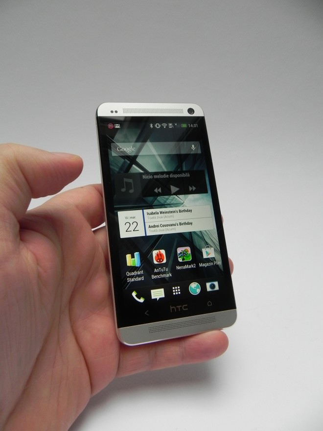
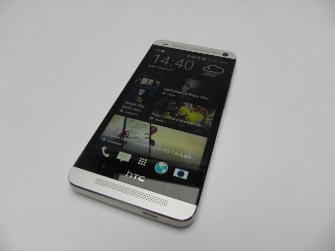
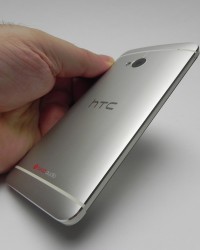
The product will be launched around April on the majority of retailers and carriers, but till then we have speculations that the price tag for this device will be around 599 euro, free of contract. HTC One comes in black and silver/aluminum, plus a red version from what we know. It measures 9.3 mm in thickness, although it seems much thinner in real life and weighs 143 grams. The case is made from a single block of anodized aluminum, as well as polycarbonate stripes.
A lot of work has been put into making this phone and the result is stunning. Inside the smartphone the components are stacked like a pyramid, just like on the HTC 8X. It means that the bigger components are on top, around the display area and the smaller ones are placed at the bottom. The result is a slightly rounded phone that looks and feel very nice.
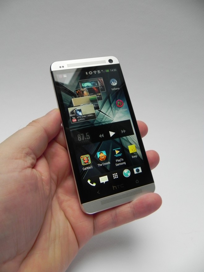
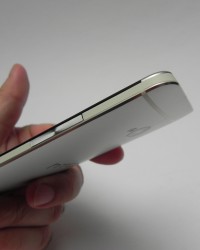
The case is an unibody aluminum one, with great grip and there are no strange gaps here, in spite of some claims I’ve heard recently. This model is very compact and sits excellently in the user’s hand. It doesn’t scratch easily, in spite of some other speculations and I’ve had it in the same pocket with keys, without any hassle or problems.
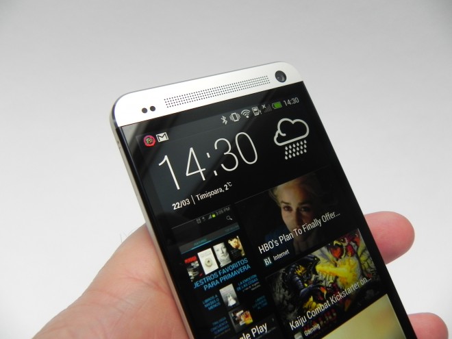
The On/Off button at the top also serves as the IR blaster and standing out at the front are the two BoomSound speakers, at the top and bottom. Below the display we’ve got two capacitive keys, instead of the usual 3, while on the side we find the microSIM card slot and at the bottom we find the microUSB/MHL port. Inside the polycarbonate strip at the upper back there’s a noise canceling microphone, as shown in the video review.
Just so you know, the HTC logo at the front sits under the glass and the white paint on the device can’t be scratched off easily. HTC adopted a zero gap construction here, so there’s no light leakage. Overall, a fantastic design and a pleasant form factor. Moving on to the hardware, we get LTE, a microSIM card slot and a crisp Super LCD 3 4.7 inch display. The screen supports a 1920 x 1080 pixel resolution and has a fantastic 469 ppi pixel density, beating the Xperia Z and Galaxy S4 with their 441 ppi.
HTC One has Gorilla Glass 2 protection, Beats Audio technology, no microSD card slot and 32/64 GB of storage. There’s also 2 GB of RAM, WiFi, DLNA, Bluetooth 4.0 and NFC. Finally, we’ve got infrared and microUSB 2.0 with MHL, while at the back sits a 4 megapixel camera with autofocus, LED flash and a pixel size of 2 microns. The front camera is a 2.1 MP unit that’s also impressive, as you’ll see later on.
Inside the device we’ve got a Qualcomm Snapdragon 600 quad core 1.7 GHz processor and an Adreno 320 GPU. Other specs include an accelerometer, gyroscope, compass, proximity sensor, stereo FM radio and a non removable Li-Polymer 2300 mAh battery, good enough for 22 hours of use in our tests. In that time we played 1 hour of Cordy 2, we filmed for 2 hours at a concert and we also did 2 solid hours of WiFi uploads on Dropbox. Other than that we did some phone calls and WiFi browsing, so the battery is actually pretty good.
On the audio side, as shown in the video the volume is CRAZY, crazy good that is. Never in my entire life have I heard such potent speakers on any tablet or phone or even some of the laptops I’ve seen. And guess what… it doesn’t even distort the sound at maximum volume. The voices are crisp, guitar is lound and clear and the dubstep bass is a killer. Beats Audio and BoomSound make an excellent team and the internal amp and dual front speakers are a fantastic combo.
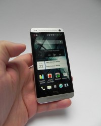
On the video side we’ve got a Super LCD 3 display, that’s good in sunlight, very bright and has wide viewing angles. The black may not be as deep as on AMOLED panels, but the colors are surely vivid and natural. The text is very crisp on web pages, even without zooming in. BlinkFeed appears to be floating on the screen at all times, so the screen is excellent.
And we’ve reached the area of the camera, the famous 4 megapixel cam with Ultrapixel tech. We’ve got some video samples and a huge photo gallery here for you. The sensor is the size of a 12 megapixel one and while Nokia 808 PureView had a pixel size of 1.4 microns, this model has a pixel size of 2 microns. The bigger pixel is called ultrapixel and this brings a lower noise level, better dynamic range and great optical image stabilization.
The sensor on the HTC One is a 1/3 inch diagonal 16:9 unit with 5 element lens with F/2.0 aperture. The camera takes 16:9 2688 x 1520 pictures or 4:3 2048 x 1520 pictures and the second generation ImageChip aids with the processing tasks. The options of the camera UI include a ton of tweaks, like effects, ISO going to 1600, white balance options, exposure, contrast, sharpness and much, much more. HDR and panorama are obviously here, as well as as slow mo capture and fast capture.
The camera’s behaviour in low light conditions is simply fantastic as shown in the video integrated in this article and also some of the pics taken at night. I’ve also taken some videos during a concert and the audio quality and video are great. The HDR pics are very bright and in case you’re wondering the video taken is at 30 FPS in 1080p and 60 FPS in 720p.
Sadly, there’s one little problem with the camera: it loses its focus when filming sometimes, a problem corrected by the just issued update. By the way, when doing video capture, the result will be a big MP4 file with 20 Mbps bitrate. The sound capture, which is excellent happens in stereo 192 Kbps at 48 Khz sampling rate. The front camera is a pleasant surprise, with a F/2.0 wide angle lens at 88 degrees and the ability to do both HDR and Full HD video capture.
And then comes HTC Zoe, that takes 20 full res pictures and a 3 second video. It takes 1 second of video before you press the shutter and 2 seconds after that. It also creates a preview of your shots in each Events section and if you play that clip you can choose a variety of effects, sounds and frames to include, to create your own Zoe collage.
You can also share Zoes online with other people. Finally, Zoe will select the faces of people in a group and circle them, then allows you to choose the ideal smile frames. There’s also the option to edit pics straight from the gallery application. Overall we’ve got a very good camera, especially in low light and especially when it comes to Zoe.
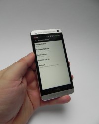
HTC One runs Android 4.1.2 with HTC Sense 5.0 and sadly its notification area lacks the toggles we’d have liked to be there. Maybe with Android 4.2.2 they will come back. On the benchmark front, we killed all Android devices available out there and I compared this model with the Sony Xperia Z and ASUS PadFone 2, two of the most powerful Android handsets at the moment.
In Quadrant, HTC One scored 12.425 points, beating the 8011 points of the Xperia Z and the 7655 points of the PadFone. In AnTutu we scored 22.573, passing the 16k points of the Xperia Z and the 21k of the PadFone 2, while in NenaMark 2, we beat those two by about 2 FPS, with 61.4 FPS. Finally, in Vellamo we scored a very good 2397 points, beating the other two models by about 200 points.
HTC Sense 5.0 is defined through simplicity and minimalism. There are 5 homescreens available, of which one is Blinkfeed and it can be set to be main Homescreen, or not if you don’t want that. The apps grid size can be changed to 3 x 4 or 4 x 5 and everything feels smooth and elegant in this UI. The omnipresence of gray contributes to that. Multitasking is done with a double press of the Home button, that triggers a window with 9 recent apps open.
You can close them by swiping each of them upwards. Since there’s no menu key, some apps will get their own virtual menu key at the bottom of the screen, just like Quadrant did, in our review. As far as BlinkFeed goes, it’s a Flipboard-like collection of Facebook feeds, tweets and news from trusted and famous blogs and news sites. It’s a flow of information served to you through a very nice looking interface. Sadly there’s no option to include a RSS feed like the one of GSMDome.com for example.
Moving further, the call quality of the device is excellent and the aluminum case doesn’t affect the signal, either cellular or WiFi. We also gave you a tour of the apps, including the TV app, that shows you a channel/programme organizer and a remote function to control your TV set. We also get a Kids Mode from Zoodles, productivity tools like Notes or Dropbox and a Car Mode.
When all’s said and done, HTC One is as close to perfection as it gets, but let’s see the final grade before deciding. Here are the PRO aspects of the phone:
- excellent design, premium materials
- gigantic audio volume/quality
- good viewing angles, brightness
- good low light camera performance
- clean UI and elegant, too
- Zoe is great
- BoomSound is fantastic
- BlinkFeed is a nice addition
- good battery
And the CONS:
- BlinkFeed may be annoying to some people
- loss of focus when filming
- no toggles in notification area
This is the best phone I’ve had the chance of testing since working for GSMDome.com and it’s been a real pleasure. We give it a 10 out of 10 for design, 9.5 for hardware and 9.5 for OS and UI. The total grade is 9.67 out of 10 and we round it up to 9.7 out of 10. Excellent work, HTC!


