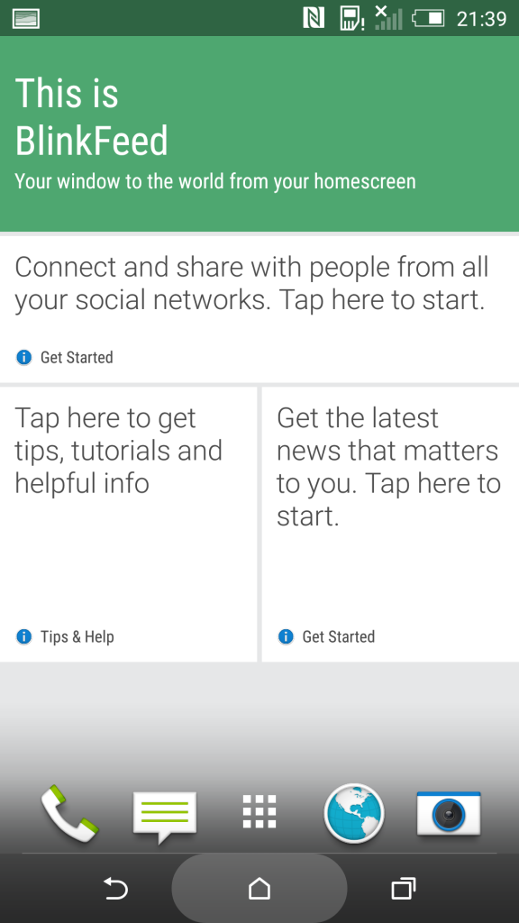
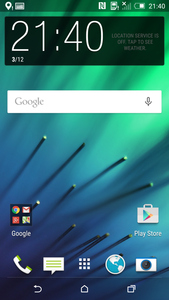
Android 5.0 and HTC Sense 6.0 have been long time in the works for the HTC one M8 and M7, suppose to get them in early January. Today we catch a fresh glimpse of their evolution.
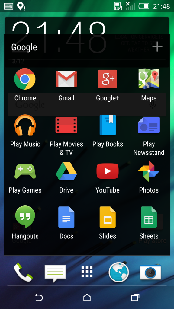
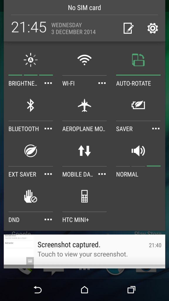
BlinkFeed is still in the mix, while the geometrical shaped Android buttons in Lollipop aren’t present, being replaced with HTC’s own version of the buttons. Also, the app area is shown with a transparent black background, instead of a white matte one, like on the other Lollipop units. Notifications are now delivered as cards and they’re shown in the same area with the quick settings.
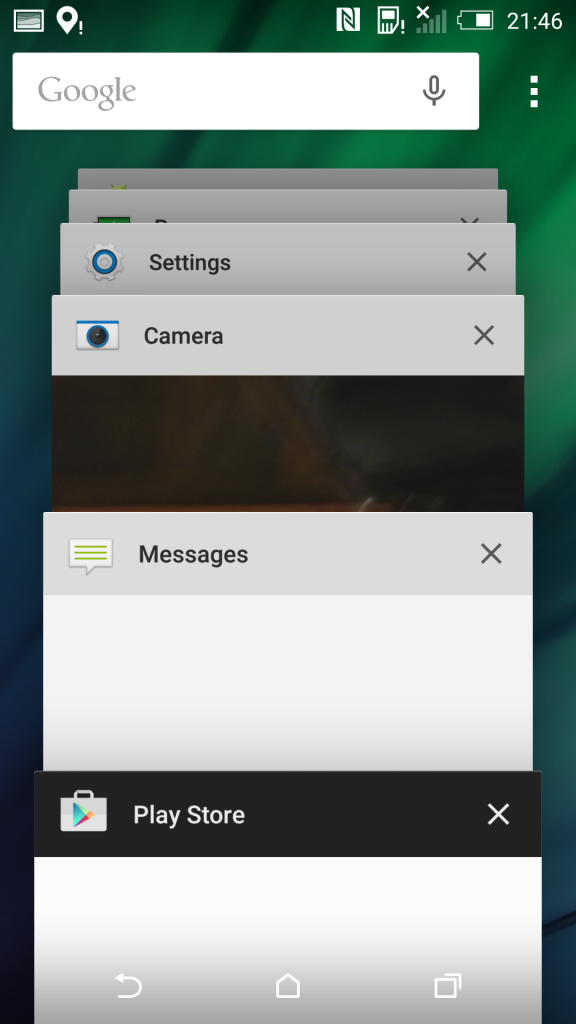
The Recents area now features that ample 3D carousel of apps shown in vertical scrolling fashion, instead of the 9 apps shown in 2D on the screen. There’s the welcome addition of the Search area in Settings and new options for Color inversion, Color Correction and High Contrast Text in the Accessibility section.
Feel free to also watch the videos below, in order to see how fluid and well the UI runs on HTC One M8:
via llabtoofer


