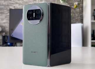
Yes, the HTC U11 Plus and HTC U11 Life have just become official and with them comes a new series of hands on videos from us, so ta-daaa, we have one below for you. We’ve handled the HTC U11 Plus, the 6 inch version of the HTC U11, that makes some design changes and also some tweaks under the hood. Priced at around $800-$900, this device is coming in December.

The biggest change has to do with the design of the facade: the fingerprint scanner has been removed from the Home button and moved to the back. Now there’s no more Home button or capacitive buttons, there’s just screen, with narrow bezels, but not exactly iPhone X narrow, at around 82% screen to body ratio. HTC U11 Plus keeps the glass back, with the nifty way of catching light effects, like the U11.

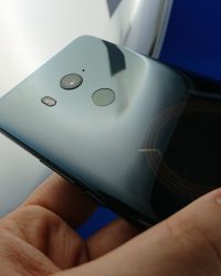
Another novelty is the fact that we have a version of this phone with a translucent back, letting you some of the components inside. One of them seems like a circular coil, maybe for wireless charging. Anyway, in spite of the diagonal increase, this glass sandwich remains quite easy to handle and use and the grip is not half bad, which for a 6 incher is great.
The resolution of the screen is 2880 x 1440 pixels and this time we also get HDR10 support, for those of you YouTuber HDR and Netflix fans out there. The core specs are quite similar to the HTC U11, from the Snapdragon 836 to the 6 GB of RAM and we also get 128 GB of storage and a microSD card slot. Aside from the jump in screen, we’ve got a bump in battery capacity, from 3000 mAh to 3930 mAh, which is not bad at all.

Let’s see in action first then judge, since the HTC U Ultra for example had a poor battery. Camera-wise, things are a mixed bag, since we’ve got the 12 megapixel main shooter from the HTC U11 with F/1.7 aperture, OIS, LED flash and 4K video capture, but the 16 MP front camera has been sliced down to an 8 MP unit. I also saw that the camera UI is basically the same, so no changes there.
Speaking of UI, this phone runs on Android 8.0 Oreo, being actually the first HTC phone with this OS installed (well technically it’s the Pixel 2, but we’ll let that slide). Acoustics aren’t neglected, as we still get dual BoomSound speakers with great bass. There’s no audio jack here, but we’ll get a bundled USB Type-C to 3.5 mm adapter. And then there’s the squeezable edge, two of them actually, letting you active the Google Assistant, camera, music player and so forth with a mere squeeze.

Now you also trigger a special semi circular menu, that shows shortcuts and options, like contacts and so forth. Basically an alternative to the curved edge shortcuts on the Galaxy Note 8 or the HTC U Ultra secondary screen. The phone will be available next month, in 3 hues, priced at around $800 or so. Yes, it’s pricey, but it also brings the best hardware HTC can offer right now. Time will tell if the new design format of the facade is well received, but I’d say that this decision is a step forward.


