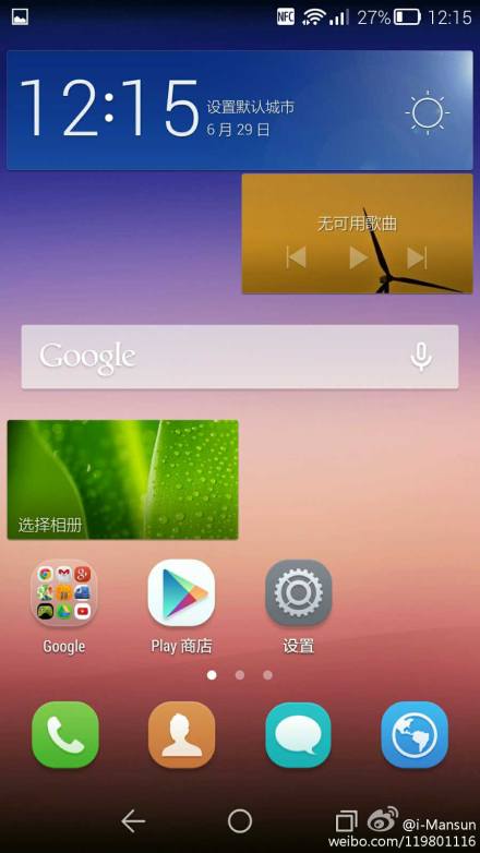
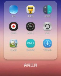
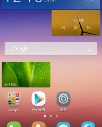
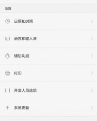
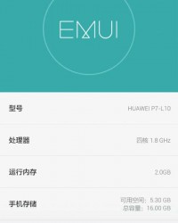
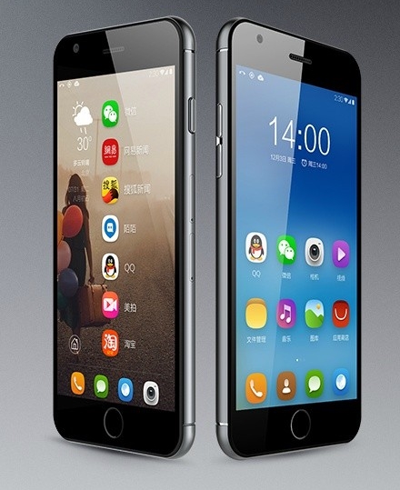
Huawei is about to follow the same route as ASUS and HTC and implement flat design elements within their UI. Weibo user @i-Mansun recently posted a few screenshots of the new UI, that wil be dubbed Emotion UI 3.0.
You can really notice the Apple-started trending of making UIs flat, that debuted last fall with iOS 7. HTC, ASUS and LG all went this way and now Huawei. Traditionally Huawei and other Chinese device makers relied on UIs that were colourful, playful, glossy and filled with customization options. Now the glossy is gone and everything is flatter and more abstract.
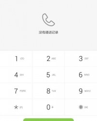
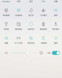
What’s interesting to me is that the Android buttons section looks very much like the one of Android L, minus geometrical shapes. The dialer is clean and uses a white background, while the toggle area is filled with options and it’s so big it makes me think of a big screen device for the next Huawei flagship. Fonts have also changed and I’m guessing transitions have too.
Via Weibo

