The iPhone 5 has one attribute that I’ll confirm right away: it glitters beautifully in bright sunlight… and that’s kind of it. It may feel light in the hand, it’s very thin and looks pretty, but that’s where the novelty stops. It’s an upgrade from the iPhone 4S, it’s longer with around 1 cm and we have more details from our detailed preview below.
We’ll be back with a full review later on, but these are the first impressions after spending an entire weekend with the device. First of all, it totally impresses on the audio side, at least through the EarPods. They fit perfectly in the ear and sound fantastic, both in volume and bass. The clarity is at its peak and the headphones somehow manage to deliver deafening sound without deafening you. The bad thing is that the speakers are actually pretty disappointing. The tunes sounds a bit… off and the back of the phone vibrates when the volume hits the peak.
As far as Siri is concerned, the update may bring stuff like being able to type on Facebook or Twitter via voice, but Google Now is still a superior service. So, you want to know what Siri can do? It provides movie reviews, posts to Twitter, Facebook, opens the camera app and gives you detailed sports information. Passbook is a new feature from iOS 6.0, that gathers your passes, vouchers, documents and other minor documents and pieces of paper/tickets in digital format you have laying around.
As far as Apple Maps go, in the area where I tested it there was a black/white stripe, actually a pretty long one, that seems like uncharted land. If you select the 3D mode you’ll see that some buildings in my area are wavy for some reason. I have to admit that the turn by turn features of the app area pretty cool and the Flyover feature looks fantastic, at least in London. However, the lack of a decent transit option for the maps and lack of POIs and entire settlements makes the app feel unfinished and rushed.
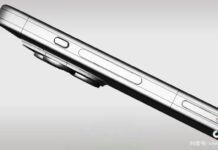
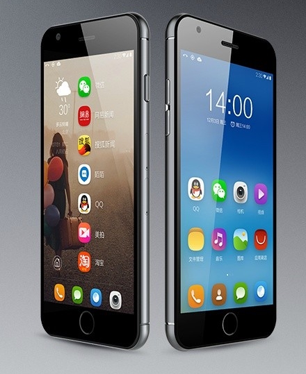
The iPhone 5 is 20% lighter than the iPhone 4S, weighing 112 grams and it also provides a 16:9 aspect ratio on the 1136 x 640 pixel display. The screen is crisp, very bright, has good viewing angles and that’s all we could find in the first days of contact. The handset measures 7.6 mm in thickness and may even feel flimsy at times, since it’s so thin, compact and light. The aluminum back offers a decent grip and you won’t drop the phone… too often.
The 1440 mAh battery is actually a pleasant surprise, since I did a lot of YouTube video watching, some game playing and browsing and I was only able to deplete around 70% of the battery in a day of casual use. There’s no trace of lag whatsoever and my first contact with the camera came with a pleasant surprise: it handles lowlight and indoor situations well. Taking a picture at night indoors results in some nice shots, with vivid colors and decent brightness. That’s all we have for now, this is the preview we have for the handset priced starting at $199 on contract in USA.
We even compared the Apple Maps solution with Google Maps on the Xperia Tablet S and as you can see the graphics are more detailed, buildings (and not only) have all the details around them clearly drawn on Google Maps while Apple Maps has some trouble with rendering such areas or showing the center of a small town. We’ll be back with a full review ASAP. And no, our unit didn’t have scuff problems and upper backlight bleeding issues.


