iPhone 6S Plus is the phablet version of the iPhone 6S and both of them were launched earlier this fall, during a major Apple event. We’re also reviewing the iPhone 6S these days, so this feels like a unitary experience of the two devices. But let’s talk more about the iPhone 6S Plus, a 5.5 inch phablet that keeps the diagonal, format and res of the predecessor, but also manages to change quite a few things.
Priced at $749 in the 16 GB version, $849 in the 64 GB version and $949 in the 128 GB one, the device is available in silver, gold, space gray and rose gold. It measures 7.3 mm in thickness, weighs 192 grams, meaning it’s thicker than the iPhone 6 Plus (7.1 mm) and heavier (172 grams). It still manages to be slimmer than the Galaxy Note 5, that has a 7.6 mm waistline. It’s heavier, because the latest Note weighs 171 grams.
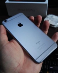
The width and height of the iPhone 6 Plus have pretty much kept intact. This time, the handset is made of 7000 Series aluminum, meaning it’s less prone to bend if you decided to give it a go. The design is the typical unibody aluminum one, with premium build and solid frame. The grip is quite good and this model isn’t easy to use with one hand, but few phablets are.
There are big bezels here, compared to what other device makers are doing and a lot of space is wasted at the top and bottom. The glass and metal fuse perfectly on the edges, in an almost curved fashion. This is a heavy and massive phone, but with a solid feel to it. Upfront we find the earpiece, selfie camera, sensors, Home button with Touch ID (comfy to press), plus the 2.5D Ion Exchange glass, that’s tougher than the glass of the rival phones.
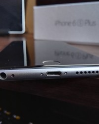
At the back there’s the slightly protruding main camera, microphone and flash and the camera has a sapphire glass protection. The ugly plastic antenna cutouts are still here and moving on, there’s nothing at the top, while at the bottom we find the audio jack and microphone (there are actually two of them, one being the first speaker grille hole), Lightning port and speaker.
To the left and right there are rounded metal edges, making the device comfier to grip. On the left there are the volume buttons and mute switch, with good feedback, while on the right there’s the Power button, equally comfy and a nano SIM card tray. Overall, this is a premium, comfy and solid phone. Now let’s analyze the hardware!
Specs include a 5.5 inch Retina HD display with 3D Touch and Full HD resolution, plus the Apple A9 processor, that caused a bit of fuss lately. Why? Because it’s available in two versions, one made by TSMC and one by Samsung. We have the Samsung model here, in case you’re wondering. The Samsung chipset is actually smaller than the TSMC one, by 10%. The first tests have also shown discrepancies between the battery life of the two models, the Samsung one being more power hungry.
Also, TSMC made their version based on the 16 nm process, while Samsung opted for the 14 nm process. Anyway, the Apple A9 is a dual core 1.84 GHz processor, with a Power VR GT7600 GPU, the M9 motion coprocessor and 2 GB of RAM. Storage is offered in 16, 64 and 128 GB versions. There’s a 12 MP camera in the mix, plus a 5 MP one upfront. The connectivity options are LTE Category 6, WiFi 802.11 a/b/g/n/ac with MIMO, Bluetooth 4.2, NFC, AGPS and Glonass.
Sensors are Touch ID, barometer, accelerometer, 3 axis gyroscope, proximity sensor, digital compass and ambient light sensor. The battery is a 2750 mAh unit (Li-Ion), so the capacity is lesser than the iPhone 6 Plus 2915 mAh power source. On paper, the battery provides 24 hours of talk time, 14 hours of video playback, 16 days of standby or 80 hours of audio playback.
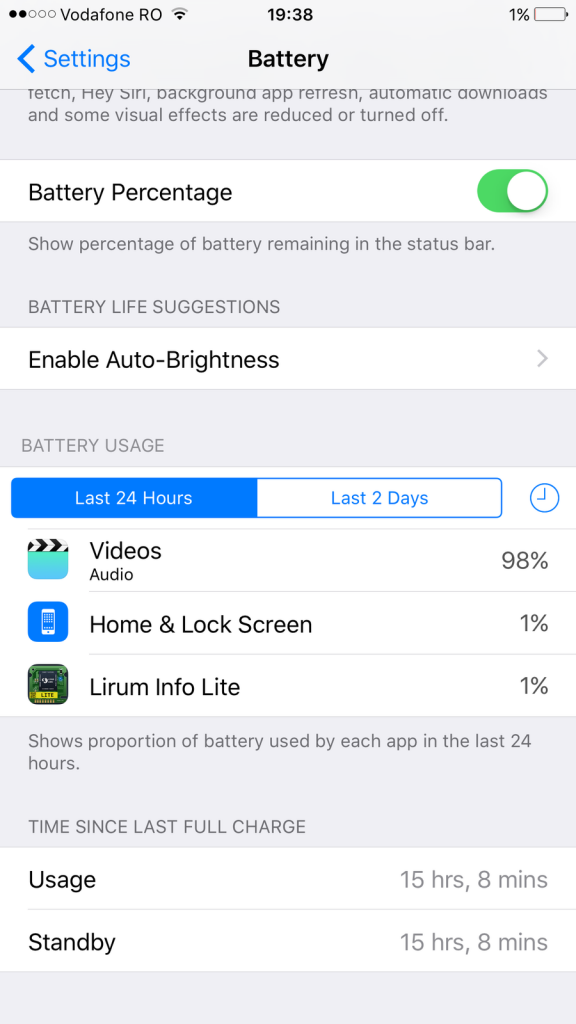
We also did a video playback test and found that when looping a HD video with WiFi on and brightness at 200 LUX we achieved a spectacular 15 hours and 8 minutes, which is great. We beat the Allview P6 Energy (12 hours 9 minutes), iPhone 6 Plus (12 hours) and Galaxy Note 5 (11 hours and 39 minutes). Only two models that we tested score more in the video playback test: Allview P8 Energy (22 hours and 24 minutes) and Lumia 1520 (17 hours).
This is a great result and the charging requires 2 hours and 57 minutes, so it’s long but it’s worth it. We did charge faster than the Allview X2 Soul Lite (3 hours and 2 minutes), Xperia M5 (3 hours 4 minutes) and iPhone 6 Plus (3 hours and 16 minutes). Of course, there are quite a few handsets that charge faster than this model: Galaxy S6 (one hour and 10 minutes), Galaxy S6 Edge+ (1 hour and 5 minutes) and Galaxy Note 5 (1 hour and 27 minutes).
With mixed usage you should be able to get one day and a half or two of functioning time. Too bad for the lack of wireless charging, that’s been popular on rival smartphones for the past year. Settings on this iPhone include Low Power Mode, that came with iOS 9.
It temporarily reduces power usage, by reducing mail fetch, background app refresh, auto downloads and visual effects, as well as CPU performance. Tests have shown that an iPhone is about 40% slower in this mode and you get about one extra hour of usage. Now let’s see what the acoustics are all about.
The speaker’s at the bottom and it’s relatively easy to cover when watching movies or playing games. Apple Music is the player you’re be using here, but it has more sections and features than before. There’s My Music, with the tunes you can listen to, For You, with the streaming option and Radio, plus Connect.
For You is basically the Apple Music service hub, where you can stream any song from the iTunes library if you pay $10 a month. First 3 months are free. Radio offers access to Beats 1, a 24/7 music station with celebrity DJs. You can also find stations tailored to your tastes. Connect is a socializing portion of the app, where you can see the singers’ social network posts, pictures and post comments.
The actual listening experience involves a loud and clear sound, great bass, warm and good voices and I have a feeling that the speaker is good for hiphop particularly. The headphones are still the Earpods of the past 4 years, that are comfy, have a huge bass and very loud volume. All notes are heard perfectly and the only bad thing about them is that people around you will hear the noise of the music coming out of your ears.
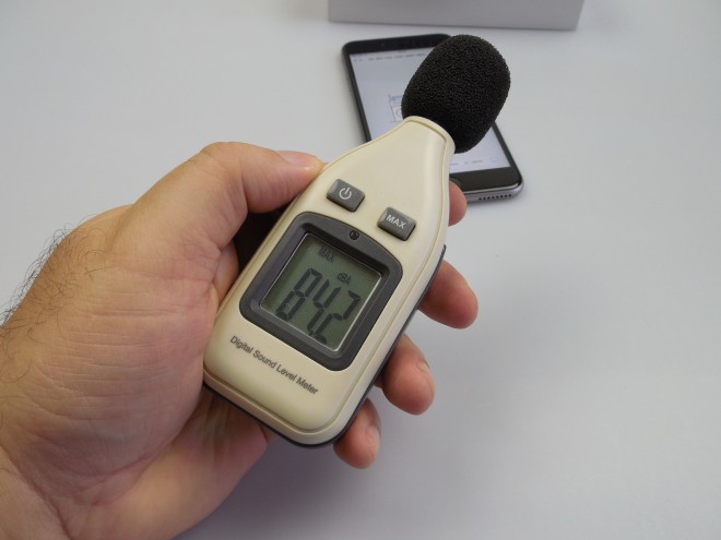
We also did a decibelmeter test and achieved 84.2 dBA at the back and front, which means we surpassed the iPhone 6 Plus (83.8 dBA), LG G Flex 2 (82.9 dBA) and Lumia 640 XL LTE (82.1 dBA). There are still other champions out there: BlackBerry Passport (95.2 dBA), OnePlus One (90.5 dBA) and iPhone 6 (85.2 dBA). The speaker remains loud, but I’ve heard louder.
In the Settings area you can find the EQ in the Music section, with options like Acoustic, Flat, Jazz, Bass Boost and more. There’s also a Max Volume Limit option and a Sound Check option. We wish the EQ would have been included in the player… Now the display is in our sight! This is a 5.5 inch Retina HD screen, with 3D Touch.
It’s an IPS LCD with LED backlight, 1920 x 1080 pixel resolution and a 1300: 1 contrast ratio. The diagonal and resolution of the predecessor are kept and we’ve got a 401 ppi density here. There’s also oleophobic coating and to play videos you’ll be using Apple’s very basic app with no sub options or other special features. The viewing experience featured bright images and vivid colors, realistic colors that is.
Contrast is good and so is sunlight legibility, plus the view angles are wide. Pixels are of the RGB Stripe kind and during the luxmeter test we achieved 573 LUX units, which means the display is bright. We surpassed the Galaxy S6 Edge+ indoor result of 546 LUX, the OnePlus 2 and its 465 LUX and the Galaxy Note 5 (indoor) at 504 LUX.
However, we scored below the iPhone 6 Plus (605 LUX), Galaxy Note 5 in sunlight (747 LUX) and Galaxy S6 Edge (933 LUX). The Settings area offers options for Display Zoom (standard or zoomed, to see the content more closely), Text Size and Bold Text. This is a great screen, but its colors are not as realistic as the ones of the LG G4, mind that!
3D Touch is a topic we extensively covered in the video review. It’s new and fresh, derived from the Apple Watch Force Touch. This tech includes capacitive sensors within the display, that measure the changes in pressure applied to the panel. There’s also a new taptic engine vibration motor, that offers subtle nudges depending on the strength of your press.
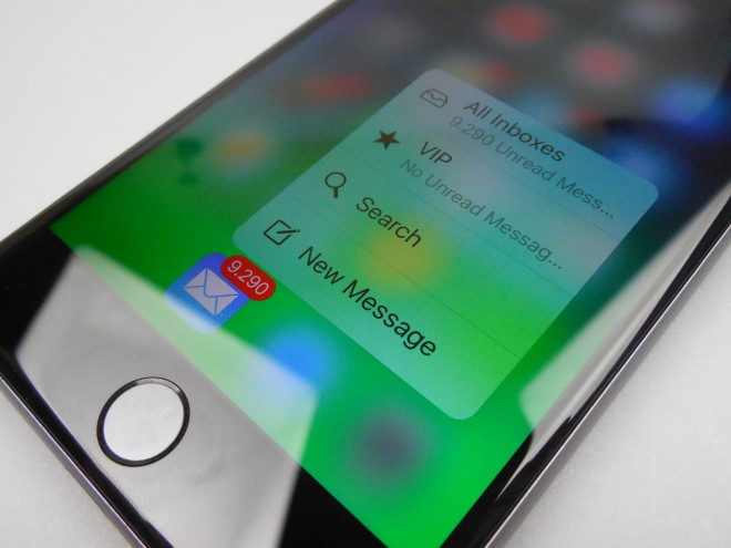
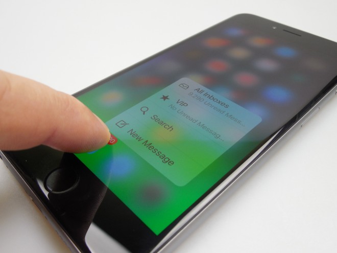
3D Touch triggers a feature called Peek and Pop, letting you Peek into an email for example by mildly pressing the screen and blurs everything around it to highlight the content, while pressing it harder further takes you to Pop, which means you enter the actual email window. This also works when you tap a link for example.
There are also Quick Actions triggered by 3D Touch, those app functions that appear next to the app icons when you press them hard on the homescreen. For example hard pressing the camera reveals options like Selfie, Video, Slow Motion and Photo in a small adjacent window. 3D Touch is also used for multitasking, since a press on the left side of the screen offers a view into the multitasking area.
Then there’s pressure sensitive drawing in Notes with varied thicknesses for various pens and Live Photos also come to life when pressed a bit hard. Another use of this technology is selecting text after looking up a word with that magnifier glass. You tap and hold to search, then press harder a bit to start selecting.
While inputing text in Messages or Notes you can also do a hard press of the keyboard and turn it into a touchpad so you can go from one area of the text to the other faster. I have to say that the future is really here and 3D Touch feels like it has a ton of potential. There are the occasional misses but nothing serious. And now we have arrived at the Camera!
It’s been years now since Apple has been using 8 megapixel cams on its main iPhones, but this year it’s different. The iPhone 6S Plus and 6S go to a 12 megapixel back shooter and front 5 MP selfie cam. The main camera offers 1.22 micron pixels, which are actually smaller than the predecessor’s, plus we also get optical image stabilization, True Tone flash, F/2.2 aperture, a 5 element lens, BSI, hybrid IR filter and 4K video capture.
Behind it all is a Sony sensor measuring 1/3 inches. The front camera has a 1/5 inch sensor, with 1.12 micron pixels, F/2.2 aperture, HD video capture and Retina Flash. The latter means that the screen brightness up to 300% its max level to lighten up your face. The Camera app opens fast and the UI is typical for iOS.
To the left there’s the front camera shortcut, then the timer and Live Photos option. That one is used to create GIF and vine-like moving pictures. You can active them with 3D Touch. They are basically 3 second videos, at 14 FPS and with 1440 x 1080 pixel resolutions. They take up 3 or 4 MB of space and are taken 1.5 seconds before you press the shutter button and 1.5 seconds after.
HDR is also available here, with the options Auto/On/Off, plus Flash with the same options and on the right side of the UI you can find 8 filters, the Panorama capture mode (around 63 MP tops), Square, Photo and Video. Then there’s Slow Mo and Time Lapse as well. Peek and Pop also works on the gallery shortcut here.
The actual camera experience involves very fast focus, very fluid zoom, an exposure slider at hand and if you keep the screen pressed you will trigger the AE/AF lock. Picture taking is fast and if you want to change the resolution of videos, you can go to Settings/Photos and Camera and tweak the video capture resolution to Full HD 60 FPS or 30 FPS, 720P in 30 FPS or 4K in 30 FPS. For slow mo options are 1080p at 120 FPS or 720p at 240 FPS.
Now we’re going to dive into the actual pics taken with the camera. We did a portion of the gallery in late October and a bit in early November, both with sunny days in the mix. First we have a gallery of pictures taken during a Hungarian sausage festival. Those feature realistic colors, good details, good exposure and white balance, plus a nice texture of the food.
Colors also stand out, even in the shade. Then we move over to a sunny day, with a HDR that makes the image too artificial, a large Panorama with no problem whatsoever with the sun in front and excellent details. The panorama has a 16382 x 3628 pixel resolution. We took some shots of a luxury car, zooming in gradually and were impressed with the results.
There’s no blur in any of the shots and the colors are now more realistic than they were on the iPhone 6 Plus shots. We also get more details, thanks to the higher resolution. Meanwhile, these colors are not as realistic as the ones of the LG G4. Selfies look crisp, beating the LG G4’s 8 MP camera at the front, but being on par with the Galaxy S6 front shooter.
I found it very odd that it’s not 100% easy to focus in extreme closeup situations, like flower macros and such. Thus, blurry closeups happened… Indoors I was also a bit underwhelmed by the grainy nature of the pics’ backgrounds. Overall, white balance and exposure were top notch and I noticed the whites and greens particularly standing out.
Great landscape shots were taken in that park towards the end of the sunny day gallery and Live Photos were also nice looking. The clarity is the same as the one on the iPhone 6 Plus and you’ll be hard pressed to tell the difference between the two models, picture-wise. iPhone 6 Plus somehow managed to get better closeups…
Finally, LG G4 and Galaxy S6 Edge and Edge+ have the upper hand on the iPhone 6S Plus in the area of closeups, colors and details, but in the selfie area the iPhone 6S Plus holds its own. Still, this is a very good flagship camera, considering it’s pitting a 12 MP sensor against models with 16 or 20 MP cameras. Imagine that this iPhone beats the HTC One M9 in a heartbeat, as well as a few Xperias from the past year.
During the night it was very hard to focus and took quite long, at least at first. The flash felt too powerful, but the brightness of the images without the flash on was quite good. There’s too much blur to tolerate and the flash problem is identical to the one of the predecessor. Street lights have big halos and the selfies with the special “flash” look fantastic.
Colors at night are zoom, zoom quality is also good and the details are better than on the iPhone 6 Plus. Pics are less yellow-ish than on the Galaxy S6 Edge+. Still, this model is far from the fantastic LG G4, that did wonders at night. We also felt it’s below the OnePlus 2 a bit… in low light conditions of course.
Overall, this doesn’t feel like a huge jump from the already good optics of the iPhone 6 Plus, just the colors are more realistic and we get more details, plus the image is less yellow at night. Selfies are much, much better, but Samsung’s big 4 models have a bit of an edge here and so does the LG G4. On the video side of things, we started off with a Full HD video at 60 FPS and with 25 Mbps bitrate.
This one had great stabilization, realistic colors, good texture and audio, plus a cinematic quality to it. The second video is also shot in 60 FPS, has excellent sound and keeps quality intact even after zooming in. The third video sees us at 30 FPS in Full HD with 18 Mbps bitrate, very clear image and no motion blur, even though we were panning quite fast.
Slow motion clips also looked nice and there were no problems with moving objects (cars) in video 5. The 4K clip we did had a 51 Mbps bitrate, looked perfect and had good exposure. The last video was an optical image stabilization test, where the iPhone 6S Plus behaved brilliantly. No focus problems were met, no loss of clarity and the video looked amazing.
I have to hand it out to Apple, they’ve created a machine that can film just as good as a handycam, at least in my book. There’s simply no imperfection in these videos. However, the low light capture was met with a very low bitrate of just 3 Mbps, yellow and dark scenery. We also had the last night time video with OK colors, but grainy and I feel that the iPhone 6 Plus filmed better at night.
The camera has evolved from the iPhone 6 Plus in the general area of video capture and 4K is a welcome addition. Selfies look great and aside from the strange focus in closeups and underwhelming night photos, I have no beef to share about this model. If you want to do some photo editing, then you’ve got the usual rotate, aspect, filters, light and color options.
We also tested the temperature of the phone after playing the game Riptide GP2 for 15 minutes and got to 35 degrees Celsius, which means there’s no overheating here. Safari is fast and lets you send links to various apps, from Messenger to Mail, Notes and more. You can copy, print and Fav sites and interestingly in landscape mode, the browser bar at the bottom pops at the with the options better spaced.
Also in landscape you’ll notice new keyboard shortcuts for Bold/Italic, copy/paste and other text editing options. Obviously the keyboard is very comfy in both portrait and landscape mode. On the connectivity side of things, we get high speed LTE, support for all big standards and good signal, as well as loud calls. Clarity is also good, although background noise isolation only works one way and I could hear all the bad noises on the other side of the line when speaking with someone.
Now it’s time for the benchmarks, in which the iPhone 6S Plus battles it out with the iPhone 6 Plus, Galaxy S6 Edge+, OnePlus 2 and LG G4, as well as the HTC One M9. It’s a battle of the Apple A9 + 2 GB of RAM vs the Apple A8 + 1 GB of RAM, Exynos 7420 + 4 GB of RAM, Snapdragon 810 2.1 + 4 GB RAM, Snapdragon 808 + 3 GB of RAM, Snapdragon 810 + 3 GB of RAM. Here are the results:
The iPhone 6S Plus is able to win 5 out of 9 benchmarks, which is a good thing and it beats the iPhone 6 Plus in 8 out of 9 tests. The jump of those scores is quite impressive. There’s no lag here and the device runs Riptide GP2 like a charm, as well as the latest NFS and FIFA titles. Now we’re off to the OS and UI side of things. Let’s tackle iOS 9 first and all of its goodies, that we decided to list in a very concise manner below:
1. You can now show iCloud Drive on a homescreen
2. Apple Pay now supports loyalty cards and store credit cards
3. Back button: go from Facebook to a link or from the Mail to a link and you’ll see it on the top left side of the screen. Sadly, it also covers up connectivity, which is a bug for me.
4. Low Power Mode and app battery usage
5. Calendar pulls info from Mail and checks Apple Maps to look up for intense traffic areas and make suggestions when to leave
6. Siri tries to find the identity of an unknown caller within Mail
7. Siri is always on and can be controlled with the ring switch.
8. News app
9. Draw on mail attachment and edit the attached pic with very complex options within the Markup area. Add text, enhance and add all sorts of stickers and crazy stuff.
10. Notes is totally revamped, with new options like drawing with various pens and a very useful ruler. You can share content to Notes, do a checklist, use formatting (body, bullet, title) and more.
11. Safari now includes a Search option
12. Apple Health gets extra options: UV exposure, water intake, reproductive health and sedentary state
13. You can now hide a group of Photos
14. High quality music streaming over cellular connection is supported
15. You can do math in Spotlight and have results from your favourite teams and weather shown
16. Ask Siri to find picture from a certain event or town and she’ll do it
17. Multitasking on iPad: slide over and split view (not on this device!)
18. Passcodes now secured with 6 digits
19. New multitasking view: carousel style
20. Quick call and text from Spotlight Search (in front of each contact you’ll see special shortcuts)
21. Quick Reply for Messages
22. Reader Mode in Safari got some new options: font, color, type, size
23. Search bar in Settings
24. Selfies and Screenshots get their own Albums in Photos
25. Siri now knows what to do when you say “Remind me of this”, while being on a web page or in an email for example
26. Hey Siri works anytime, not just when the device is plugged in like in iOS 8. You can also tweak it so it recognizes only your voice, not other people’s
27. Transit directions in Apple Maps (stations, times and more).
28. Siri Suggestions: sort of like the Google Now homescreen, leftmost of all homescreens and featuring Contacts and apps you use often, plus info like weather, or favourite team score.
29. WiFi Assist (auto use WiFi when cellular connectivity is poor)
30. Pinch and zoom inside a video in Photos
31. Easier scrolling among pictures, thanks to the thumbnails shown below them
32. Chronological view for notifications (most recent on top)
33. New San Francisco font: more rounded and compact
34. More intuitive Shift Key on keyboard
35. Now you can ask Siri to play a song from a certain time period
36. Upper and lower case keyboard
The UI stays the same as before and now you can set a live photo as the lockscreen. There’s also the dual pane layout in apps like Settings, Mail or Safari, with the right side showing content and the left “categories” or such. iOS 9.1 brought 150 new emojis, a way for Live Photos to feel if you’re lowering or raising the phone and Apple News in UK. By the way we also tested Touch ID and found it to be very fast and accurate, a bit improved over the previous gen.
Now it’s time to check out the preinstalled apps. There’s no bloatware here and the list goes like this:
Messages
Calendar
Photos
Camera
Weather
Clock
Maps
Videos
Wallet
Notes
Reminders
Stocks
iTunes Store
App Store
iBooks
News
Health
Settings
Facetime
Calculator
Podcasts
Watch
Game Center
Compass
Tips
Voice Memos
Contacts
Find Friends Find iPhone
The News app feels a bit like Flipboard, only with more focus on text and less on photos. It has the following sections: For You, Favourites, Explore, Search and Saved. The dropdown area features notifications and widgets, while the Control Center is the same, with connectivity settings, brightness slider and some shortcuts to features like flashlight and camera.
And now let’s see the verdict!
Here are the Pros:
premium materials and solid design
comfy to use
great battery
good acoustics
bright display
3D Touch is the future and it works great
realistic colors and good details in pictures
great selfies
fantastic video capture
great benchmarks
good performance
iOS now evolves in a great way and it’s mature
And the Cons:
heavy phone
16 GB start version (32 would have made more sense for a handset that films 4K)
long charging
CPU version discrepancies
no wireless charging
closeups have some focus problems
HDR is artificial looking
flash is too bright at night
night time videos are also not so good
Back button covers signal symbols
3D Touch has some misses
We don’t grade handsets any more, but we can tell you this: the iPhone 6S Plus is an excellent smartphone, but not a huge jump from the iPhone 6 Plus, that was already a great device. We can’t exactly say that it beats the Galaxy Note 5, LG G4 or Galaxy S6 Edge+, except when it comes to innovations like 3D touch and filming. I like the more mature iOS 9, great materials and perfect battery life, beating the above mentioned rivals.
However in the end the price may be a bummer, the long charge, lack of wireless charging and lack of more manual options for the camera may push you in Samsung’s direction. If you’ve been with iOS all along, there’s no reason to not get an iPhone 6S Plus if you haven’t upgraded in 2 or 3 years.


