We learned a while ago that the new Lenovo Vibe UI 2.0 was going to come soon and today we get a few official images that illustrate the way this interface works. They come straight from Lenovo, so this guide is as official as it gets.
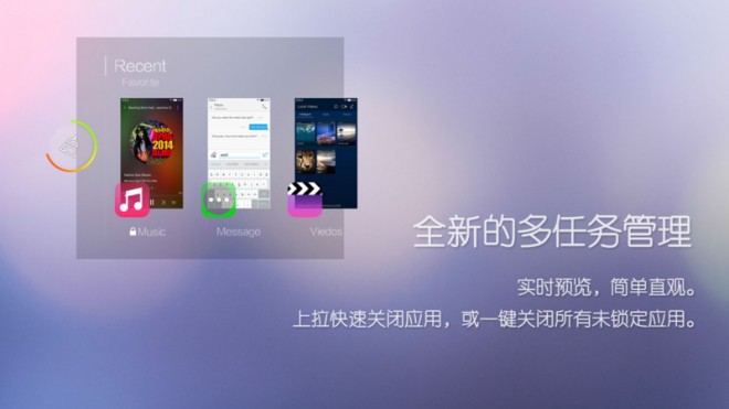
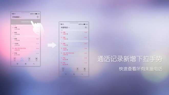
The UI has been redesigned to suit the Chinese public’s habits and apparently one of the new things here is the brightness slider, that’s different than usual in some way (as the guide claims). There’s also a new multitasking system included, that seems to separate apps in a more distinct way than before, upgrading them from a mere tile to something bigger. There’s a minimalistic dropdown area that displays call records and we’ve also got a two finger pinch gesture for the contacts, in order to view their details.
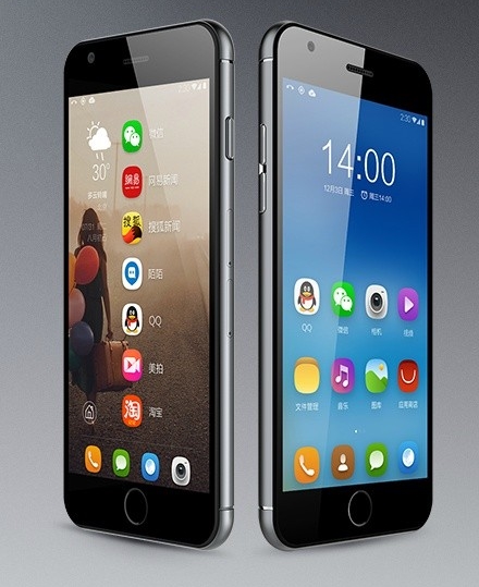
At the end of July we learned that Lenovo Vibe UI 2.0 developer edition was ready for a few smartphones and we also got cozy with the UI while checking out this early review of the Lenovo Vibe Z2 Pro handset. This UI brings among others rounded icons, new widgets and screenlock effects and a brand new music player, that feels a bit like the one on Oppo devices.
The whole interface feels minimalistic and while it’s colourful, at least it doesn’t exaggerate with childish hues.
Via Lenovo


