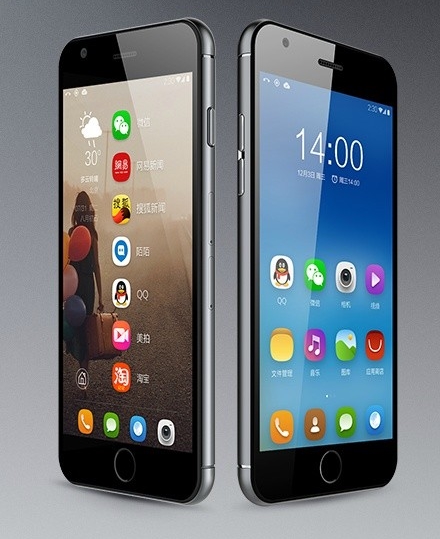
We’ve found interesting evidence today regarding the resemblance between Meizu’s Flyme OS 4.0 applied on top of KitKat and MIUI 6, that Xiaomi offers on its latest devices. Below you can see the two platforms’ lockscreens, that are very similar.
The question is who copied who? As far as we know, the image above was posted by Meizu with the date 15 August associated with Flyme 4.0’s screen, while the MIUI 6 had August 16 as the date. This means Xiaomi is supposed to be the copycat. The color choice is different and only the orange bubble and yellow ones are present in both images. The fonts are also different: just look at the zeros in both images and you’ll figure that out.
Anyway, we’d have to see the full versions of both UIs to judge who copied who. After seeing a ton of leaks of Flyme, MIUI, Huawei’s new Emotion and more fresh UIs, I have to say that everyone is going with the same “flat plus grey/green” approach, that LG, HTC and ASUS have used on their UIs this year. While these 3 brands managed to coexist within this UI boundaries, why can’t Meizu and Xiaomi do that?
Via igeek.com.cn


