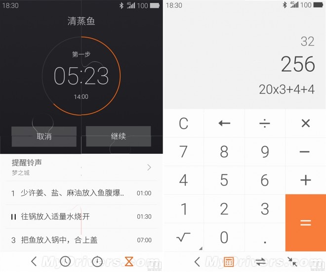
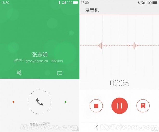
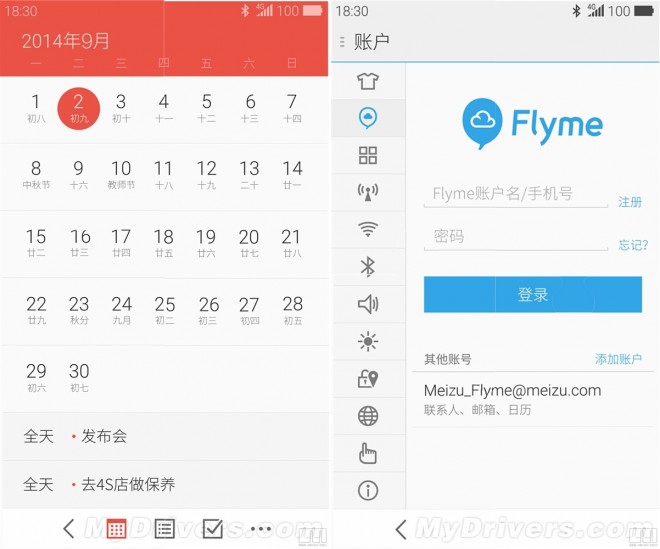
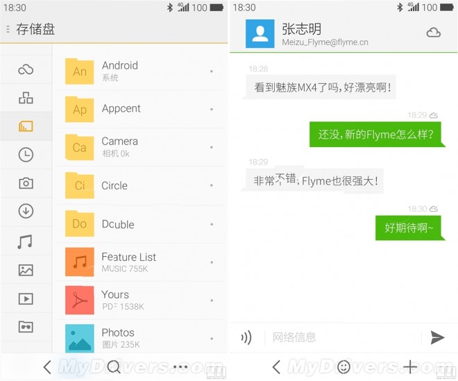
As you may know, the Chinese producer Meizu is getting ready right now for the launch of its new flagship device called Meizu MX4, a powerful smartphone that will bring very slim bezels and a beautiful design. Once with this phone we’ll also see the new custom interface developed by Meizu.
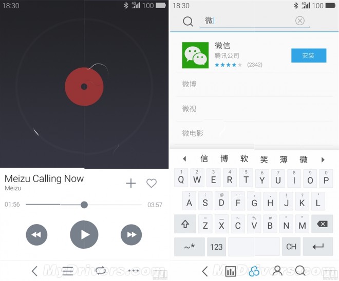
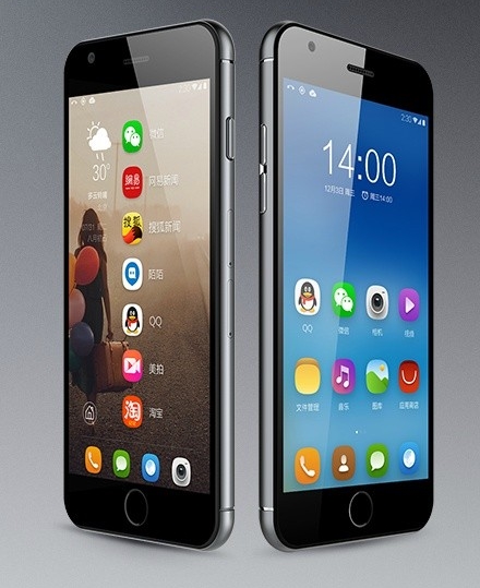
This one is called Flyme OS, and now will get the 4.0 version. Recently, a couple of screenshots with the Flyme OS 4.0 arrived on the web revealing how it will look in terms of design. As you can see, Meizu adopted flat icons and a minimalistic look, design that a lot of producers developed lately on their new custom interfaces.
The prominent color found in Flyme 4.0 OS is white, a lot of apps using this color to make the user experience more simple and more attractive for the users. Looking at all the custom interfaces launched on the market lately like the MIUI 6, which one do you think looks better?
via: igeek.com.cn


