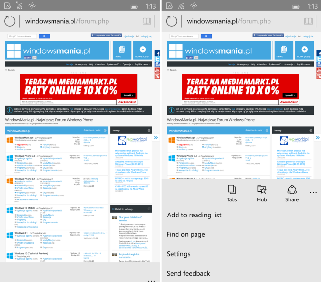
Lately we’ve been hearing a lot about Internet Explorer and its death, so it’s time to get used to Project Spartan. The web browser was quickly detailed during the Windows 10 event that took place earlier this year and today we get to see fresh screenshots coming from a website in Poland.
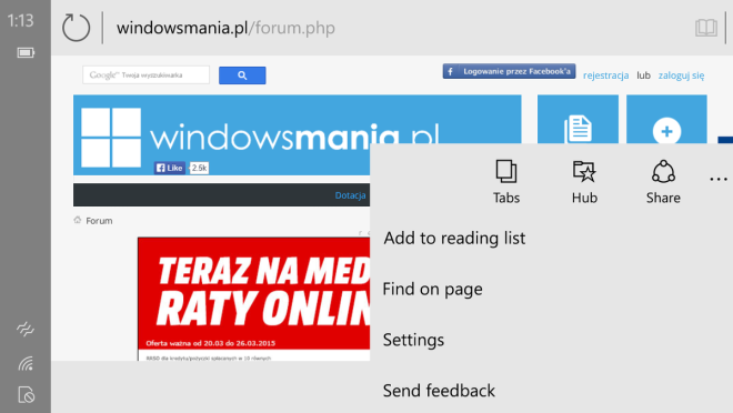
As known before, this browser offers a minimalistic UI, based on white and gray hues. Project Spartan is shown on a Windows 10 for Phone device, of unknown origin. The main change here is the moved address bar, that on IE Mobile for Windows Phone was placed at the bottom and now it’s placed at the top. There’s also a section labeled “Hub”, that seems to work as sort of a repository for articles store for offline reading.
Also, it’s important to note that the web browser is using ellipses rather than the hamburger button used so often on Android for menu access. There’s also a flip ahead feature, that allows the browser to predict the next page and speed up browsing.
via windowscentral


