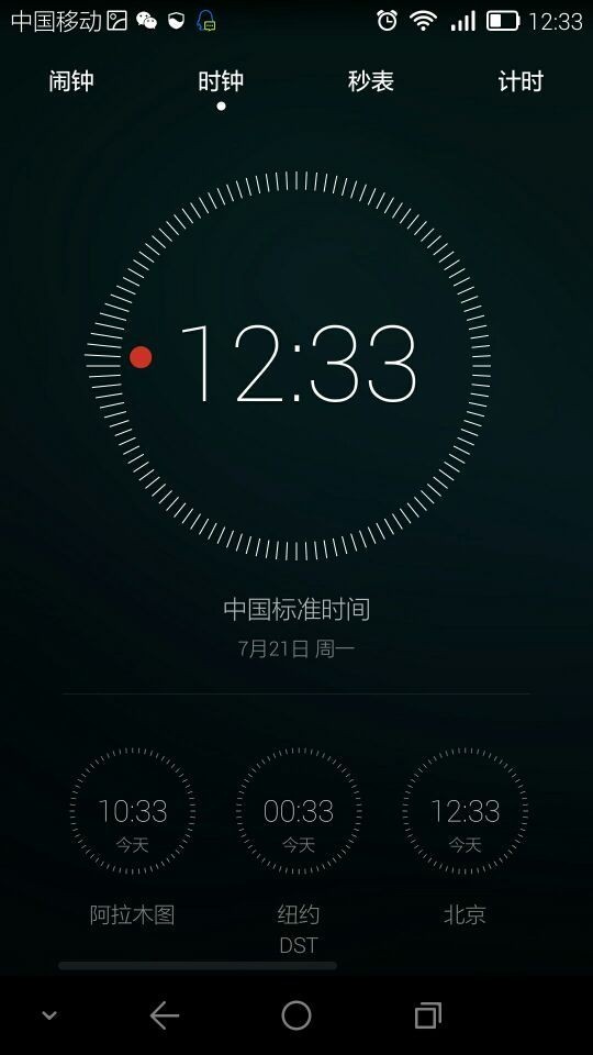
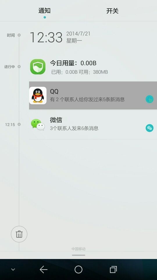
Last week we had a leak of Huawei’s Emotion UI 3.0, that’s meant to debut on the new phones they launch today. The leak continues today with the images below, showing us a fresh glimpse at the Emotion UI 3.0 and its minimalistic approach.
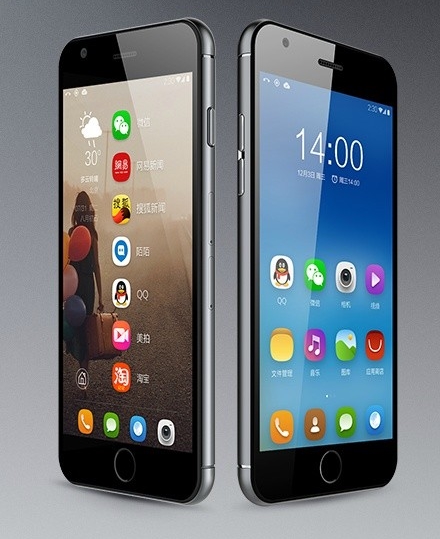
If you compare the new approach to Emotion UI 2.3, you’ll see that the change is quite impressive. Current higher end Huawei models will get the new UI around September, according to people in the know. The UI is flat, very simple and in keeping with current trends started last year by Apple and its iOS 7. Among the latest brands to adhere to that direction is LG and the new LG G3 UI, ASUS and its Zen UI and HTC with Sense 6.0.
The concept is simple: no gloss on the icons and widgets, flat design elements, abstract images used for icons and less 3D elements included in the UI. The most interesting bit here is the choice of virtual Android buttons, that totally look like the Android L ones. This also confirms that at least one of the phones launched today won’t have capacitive buttons.
Via cnbeta.com

