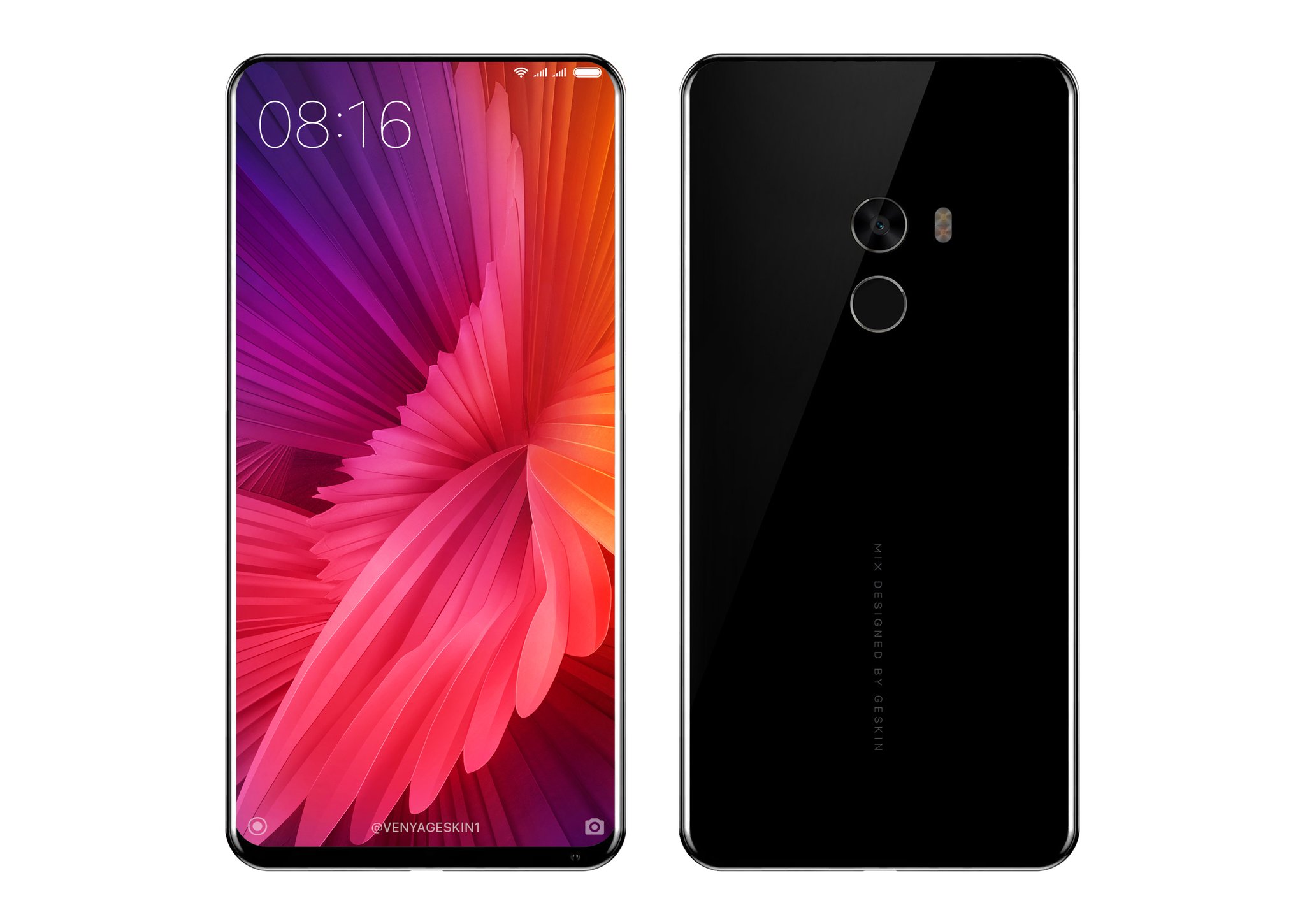
The Xiaomi Mi MIX 2 has leaked much less than one would expect for such an exciting product, but yesterday brought us some fresh renders from the man himself, Philippe Starck. He’s the designer in charge of the project and now drawing inspiration from its work, Benjamin Geskin has created his own set of renders for the machine.
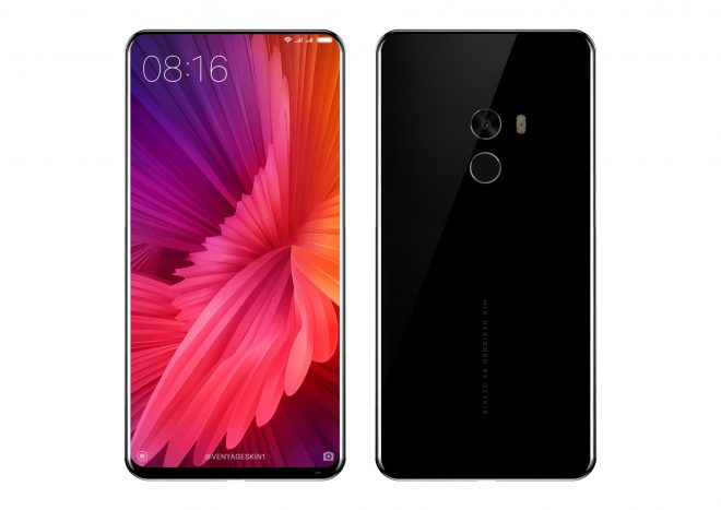
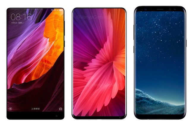
Benjamin is famous for his iPhone 8 renders and he also envisioned other devices, like the Essential Phone or the iPad Pro 10.5. Now he tackles the Xiaomi Mi MIX 2 and even does a comparison render against the Galaxy S8 Plus and Xiaomi Mi MIX first gen model. You can check it out below. The bezel less newcomer also gets a look at the back this time, something that not even Philippe Starck delivered.
I’m surprised to see a singular camera here, not a dual one and I feel that it’s a bit too low to be comfy. A fingerprint scanner is also at the back, although a part of me expects it to be integrated within the display. The handset’s facade is basically all screen, with an incredible screen to body ratio, that probably goes past 90%. The front camera is tucked at the bottom side, from what I can see and the earpiece is gone, replaced with a piezoelectric mechanism.
I feel some Galaxy S8 influences here, particularly at the corners. One thing’s for sure: this device is narrower than the first Mi MIX, less squared and shorter than the Galaxy S8 Plus.
via: Technobuffalo
source: Benjamin Geskin

